Tag Archives: Social Network Analysis

Intradepartmental Communications as a Percentage of Total Departmental Communication

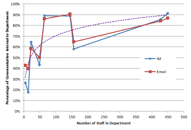
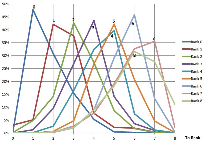
Any organisation wishing to improve will be interested in how the company functions structurally and want to investigate the causes of deviancy (weather positive or negative) from the norm. The chart below shows the percentage of communication a department generates that is internal to that department plotted against the number of people in the department. The plot is split into two: one for product-focussed departments and one for shared service departments, like HR or Accounts. As can be seen the product-focussed departments are fairly consistent, regardless of size, in that their communications are 85%-95% internal. On the other hand the departments that provide a shared service have an internal communication percentage proportional to the size of the department. Thinking about the results it does seem logical that the shared service departments are more likely to be communicating with other departments than internally but, as they grow in size, will need more internal communication to co-ordinate activities.

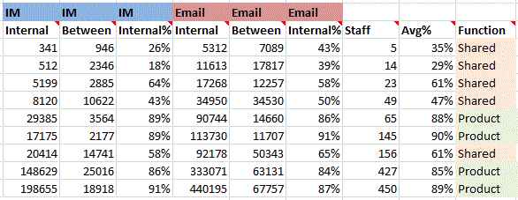
See my previous post for the underlying data.

Internal comms percentage for Product and Shared departments

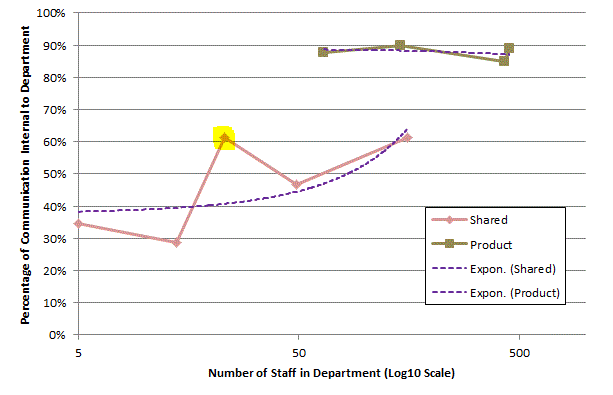
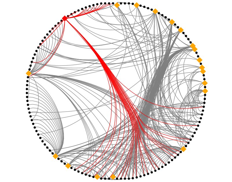
One of the shared service departments, highlighted, spends more time communicating
internally than would be expected looking at the above chart. I can’t say which
department this is but will say that I’m surprised as to which one it is.
Identifying these deviancies (which could be positive or negative depending on
how well the deviant department is performing) allow the organisation to
identify areas for further investigation in order to improve.


Email vs. Instant Messaging for Social Network Analysis, Round 1

Email has long been studied to understand Social Networks. In more recent years organisations have embraced internal Instant Messaging, such as Microsoft Lync. Any organisation that wants to understand the Social Networks, and other insights communication data might reveal, will want to know if analysis of Instant Messaging logs can enhance insight from other sources like Email. Depending on an organisations culture Email and Instant Messaging (IM) may represent different levels of trust or formality; revealing a cultural meaning of Email versus IM is beyond this discussion but anyone who has spent a reasonable amount of time in an organisation will probably be aware of that organisation’s cultural tendencies in communications.

My initial question is does IM show us anything Email does not? Starting at a macro view I revisited the inter-departmental communications: there was not much difference when looking at the IM traffic versus the Email traffic (when viewed as percentages of overall traffic) but there did seem to be some potentially significant differences in the volumes of communications internal to a department (I did not previously examine these numbers).

To further explore differences between IM and Email, at a macro level, I have looked at the percentage of internal departmental communication compared to total communication emanation from the department. Here is a chart of the results:

Internal comms percentage for email and IM

For the purposes of looking at differences between IM and Email, this chart shows there does not seem to be much difference in the ratio of use between intra- and inter-departmental communications. My conclusion, so-far, is that there does not seem to be significant differences in the use of IM versus Email at this level.

As an aside, the above graph does seem somewhat inconsistent in the function between department size and the percentage of communication that is internal. Looking at the purpose of each department they can be categorised as either ‘Product’ (focussed on selling and servicing a product line) or ‘Shared’ (e.g. HR, Accounts) and these seem to fall neatly into those with an internal communications level below 70% (Shared) and above 80% (Product); here is a table of the data:

Internal comms data for email and IM

As this is leaving my discussion of differences between Email and IM (this shows very little) I’ll explain more in another post.


Chord Diagrams

Circular layouts work well for individual to individual visualisations but for group to
group (such as departments in an organisation) where there is close to a fully
connected graph chord diagrams seem to offer a clearer layout. The following
diagram shows the same data for the volume of communication between
departments. They don’t quite show the same thing: the circular layout’s nodes
are proportional to the size of the department whereas the chord is based
purely on the volume of communication.

circular vs chord

The circular diagram was created with the circular layout plugin in Gephi; the chord diagram is adapted from this article and uses the ds.j3 library which means it’s interactive in the browser.

Circular Layouts, Binning and Edge Bundling

Circular layouts can be very useful and NodeXL does a great job of rapidly exploring social network graphs. However I needed to generate graphs programmatically so turned to the NodeXL libraries. I picked the circular layout but was disappointed with what it produced:

circular plain

Let me explain what this diagram is attempting to show: the rectangular labels are the organisation’s tweeters, the colours represent a sub-division of the organisation they work for. Unlabelled nodes (circles) are the followers. Followers are coloured green or orange based on which information the organisations would like them to receive and this colouring is the same for two specialist sub-divisions. Where an orange line is seen going to a green follower, or vice-versa, then it can be implied that the follower is not receiving the desired information.

This layout is not great: the order of nodes is just as they were added to the graph: all the organisations’ tweeters were added first so cluster together and there is no logic to the order the remaining nodes (followers) are added.

The first improvement that can be made is to use binning. See  http://www.smrfoundation.org/2010/01/14/component-binning-a-network-layout-improvement-in-nodexl-v-108/

To apply Binning with the NodeXL library simply set the UseBinning property:

oCircleLayout.LayoutStyle = LayoutStyle.UseBinning;

The layout now looks like this:

circular binning

We can see now that there is a cluster of followers who follow multiple tweeters from the organisation (clustered towards the top). However it is still quite confusing where a lot of lines cross-over. Maybe curved lines would be better….

oNodeXLVisual.GraphDrawer.EdgeDrawer.CurveStyle = EdgeCurveStyle.Bezier;

circular bezier

Not really an improvement. The answer is Edge Bundling, see these links for better explanations than I can provide:

http://www.cg.tuwien.ac.at/courses/InfoVis/HallOfFame/2007/Alsallakh/

http://www.win.tue.nl/~dholten/papers/bundles_infovis.pdf

http://www.infosthetics.com/archives/2009/06/force_directed_edge_bundling_for_graph_visualization.html

this is how to add it from the NodeXL libraries:

EdgeBundler ebl = new EdgeBundler();

ebl.UseThreading = false; // when running in Azure or it hangs

ebl.BundleAllEdges(oGraph, new Rectangle(0, 0, GraphWidth, GraphHeight));

oNodeXLVisual.GraphDrawer.EdgeDrawer.CurveStyle = EdgeCurveStyle.CurveThroughIntermediatePoints; 

and the result:

circular bundling

which I hope you’ll agree helps reveal some real structure about the tweeters and
their followers.

Update 15/07/2013

I’ve created a test page if you want to try out these features of NodeXL here or get NodeXL

Visualisation for Twitter Followers

An organisation wanting to get its message out through social platforms needs to understand the relationships between the organisations tweeters and their followers. For example how much overlap is there or how many target twitter followers would be totally lost if one of the organisations tweeters was lost. Whilst it’s easy to obtain the basic information about followers and analyse this in tabular format it would be nice if there was a visualisation that convey this information in a more digestible format. Step forward the circular layout:

TweeterEdgeBundleNoLabels

This visualisation was created with NodeXL using the circular layout and bundled edges. The orange diamonds are the organisations’ tweeters and the black circles are followers. One tweeter has been selected and their followers highlighted, in red. The following observations can be made:

  • There are a number of followers who only follow one of the organisations’ tweeters (look at 7 – 12 o’clock)
  • The thickest bundle of connections identifies a number of the organisations’ tweeters with a significant overlap of followers (look at 2 o’clock and  5  – 6 o’clock)
  • The tweeter highlighted in red has a mix of unique and shared followers.

These observations can be used by the organisation to consider how best to get its message to target followers.

Time Well Spent at Cloud World Forum and Big Data World Congress

cwf_bdwc

An interseting couple of days.

Google are targeting enterprises as a PaaS provider. Their view is Digital Natives will bring consumer technologies into the workplace and concentrate on systems of collaboration rather than systems of record . They put a lot of value in the Gartner Nexus of Forces.

Performance Management of Cloud Platforms (PaaS): with elastic computing sloppy development of inefficient code can be masked by infrastructure but at what cost? Application Performance Monitoring may be more important, than in on-prem, to help stop money leaks.

The panel discussion of Big Data Skills started with a great quote: “do you have a [Big Data] Problem or is it a Big [Data Problem]?”, well I found it amusing. The discussion concluded that:

  • Many organisations are struggling to get Big Data out of R&D
  • We need to be careful that it does not become over-intrusive in people’s lives

As we know there is rarely anything genuinely new: I met the guys from elasticsearch who explained it uses Lucene (as does Neo4j) to index text and that this was something called an inverted index. Well that bought back a few memories from the early 90s when I worked for Dataware Technologies integrating BRS into customer solutions.

The Open Data Institute promote the use of government data and offer help (not financial) to start-ups who want to take that data and add value to it.

Talend echoed sentiment from last week’s BDA conference: why Extract – Transform – Load when you can Extract – Load – Transform using Hadoop.

The Cloud Security Alliance called for more transparency and honesty which should apply to corporations as well as governments. It’s something Enterprise Architects need to consider when they examine proposals that will impact individuals’ anonymity.

The question of whether recent revelations about PRISM will see people move away from Facebook was raise during a panel discussing protection of sensitive data in the cloud. I suspect not but time will tell.

Digital Innovation Group reinforced the message about the importance of context and trying to understand the language of peoples social media output. You need to be able to deal with slang and differentiate between not agreeing with an opinion versus that being their opinion.

Calculating Influence

If influence can roughly be equated with the volume, and to whom, an individual communicates then an ‘influencing score’ can be calculated. I’m not looking here at measures of centrality; although I do plan in incorporate this at a later date. Within what appears to be a command-and control organisation rank is very important and is known for each individual. I propose that the influencing score between any two individuals is made from the following three factors:

  • The rank of the target to which the subject is connected
  • The strength of the connection (dictated by the lowest scoring edge)
  • The distance (number of edges) from the subject to the target

It would also be essential to track changes over time is this to be a useful measure.

How did I go about creating this?

  • First I created a scored relationship, as described before, (but reducing the value of being a line manager to 30) between each person (node) on a per-month basis. Each relationship (link) was typed consistently so, for example for May 2013 is called MONTH_2013_05
  • Secondly I use a dynamically generated Cypher query  to obtain the graph (network) of relationships to the subject for each month:  START n=node:node_auto_index(email = ‘[email protected]’) MATCH p = (n)-[:MONTH_2013_05*1..2]-(x) RETURN DISTINCT ‘~’ AS begin, length(p) AS len, EXTRACT( n IN NODES(p):n.email + ‘<‘ + n.rank + ‘>’) AS email, EXTRACT( r IN RELATIONSHIPS(p):r.score) AS score. I won’t pick this query apart here but if anyone wants an explanation please get in touch. I’m also not using any Neo4j client libraries and simply parsing out the result which is why there is a ‘~‘ to mark the start of each record.
  • The score, for each path (the ‘p’ in the Cypher query is then calculated and all the scores are added together. Here is an example:  A—(67)—B—(50)—C<rank 4> where A is the subject  has a score of 50 (the weakest link) * 6 ( the multiplier for rank 4, more later) * 0.1 (the distance factor)

Because rank is considered so important the highest ranks are given much higher multipliers as listed: 0:100, 1:50, 2:25, 3:12, 4:6, 5:3, 6:2, <=7:1

Indirect relationships are reduced to 10% of the score for a direct relationship. The Cypher query only returns a maximum of 1 intermediate node (1..2)

The following chart shows a plot for three individuals who are in a direct line of management; as expected the influencing score drops as the rank drops. The relative scores are also reasonably consistent.

influence1

The next plot shows another direct line management relationship, the senior manager is the same as before. This time it shows a distinct rise in influence of the mid-ranked individual.

influence2

The measurement of influence I have described is fairly crude, for example it bounces around based on when people are on holiday (this can be fixed by using a value averaged over active days) and there is a degree of double-counting (which can be removed by pruning indirect connections when a direct connection exists) however empirically it produces results that reflect reality of individuals known to the author.

Is 1.66 the cosmological constant of Email?

After 6 months of colleting email data it should be possible to spot trends and variations. Some variations, mostly around holiday periods are quite obvious but trends have not been so obvious. One measure in particular has been remarkably constant: the average number of recipients per email. The following plot shows this average over the last 27 weeks for approximately 2,000 people and 10,000,000 emails:

recipients per email

The average across the entire period is 1.66. The only noticeable variation occurs during the Christmas holiday when the organisation is almost completely closed.

Compare this with a couple of other averages:

emails per unique sender

MBytes per unique sender

That last one, which effectively shows the average size of emails, is interesting in that there is a peak immediately following the end of the Christmas holiday; this could be interpreted as a build-up of information suddenly being released or it could be because there is a lot of ‘set-up’ information sent around at the beginning of the year.


What is the distribution of emails sent from one rank to another?

Whilst it appears higher ranks tend to send email downwards and lower ranks upward for a more detailed view it is possible to plot, for each rank, to which other ranks email is being sent. The plots are shown below:

Email_detailed_direction_by_rankJPG

Looking at these plots it can be seen ranks 0-4 send more email to the rank below than any other; ranks 5-7 send more email to the same rank than any other and only 8 sends more upwards (mostly to 6 and7). It can also be observed that the ranks to which email is sent are fairly tightly packed around the sending rank. Without other organisations to observe it difficult to make sweeping generic statements but I think this shows a lack of ‘mobility’ between the ranks and suggests a command-and-control mentality.