Category Archives: NodeXL

Circular Layouts, Binning and Edge Bundling

Circular layouts can be very useful and NodeXL does a great job of rapidly exploring social network graphs. However I needed to generate graphs programmatically so turned to the NodeXL libraries. I picked the circular layout but was disappointed with what it produced:

circular plain

Let me explain what this diagram is attempting to show: the rectangular labels are the organisation’s tweeters, the colours represent a sub-division of the organisation they work for. Unlabelled nodes (circles) are the followers. Followers are coloured green or orange based on which information the organisations would like them to receive and this colouring is the same for two specialist sub-divisions. Where an orange line is seen going to a green follower, or vice-versa, then it can be implied that the follower is not receiving the desired information.

This layout is not great: the order of nodes is just as they were added to the graph: all the organisations’ tweeters were added first so cluster together and there is no logic to the order the remaining nodes (followers) are added.

The first improvement that can be made is to use binning. See  http://www.smrfoundation.org/2010/01/14/component-binning-a-network-layout-improvement-in-nodexl-v-108/

To apply Binning with the NodeXL library simply set the UseBinning property:

oCircleLayout.LayoutStyle = LayoutStyle.UseBinning;

The layout now looks like this:

circular binning

We can see now that there is a cluster of followers who follow multiple tweeters from the organisation (clustered towards the top). However it is still quite confusing where a lot of lines cross-over. Maybe curved lines would be better….

oNodeXLVisual.GraphDrawer.EdgeDrawer.CurveStyle = EdgeCurveStyle.Bezier;

circular bezier

Not really an improvement. The answer is Edge Bundling, see these links for better explanations than I can provide:

http://www.cg.tuwien.ac.at/courses/InfoVis/HallOfFame/2007/Alsallakh/

http://www.win.tue.nl/~dholten/papers/bundles_infovis.pdf

http://www.infosthetics.com/archives/2009/06/force_directed_edge_bundling_for_graph_visualization.html

this is how to add it from the NodeXL libraries:

EdgeBundler ebl = new EdgeBundler();

ebl.UseThreading = false; // when running in Azure or it hangs

ebl.BundleAllEdges(oGraph, new Rectangle(0, 0, GraphWidth, GraphHeight));

oNodeXLVisual.GraphDrawer.EdgeDrawer.CurveStyle = EdgeCurveStyle.CurveThroughIntermediatePoints; 

and the result:

circular bundling

which I hope you’ll agree helps reveal some real structure about the tweeters and
their followers.

Update 15/07/2013

I’ve created a test page if you want to try out these features of NodeXL here or get NodeXL

Visualisation for Twitter Followers

An organisation wanting to get its message out through social platforms needs to understand the relationships between the organisations tweeters and their followers. For example how much overlap is there or how many target twitter followers would be totally lost if one of the organisations tweeters was lost. Whilst it’s easy to obtain the basic information about followers and analyse this in tabular format it would be nice if there was a visualisation that convey this information in a more digestible format. Step forward the circular layout:

TweeterEdgeBundleNoLabels

This visualisation was created with NodeXL using the circular layout and bundled edges. The orange diamonds are the organisations’ tweeters and the black circles are followers. One tweeter has been selected and their followers highlighted, in red. The following observations can be made:

  • There are a number of followers who only follow one of the organisations’ tweeters (look at 7 – 12 o’clock)
  • The thickest bundle of connections identifies a number of the organisations’ tweeters with a significant overlap of followers (look at 2 o’clock and  5  – 6 o’clock)
  • The tweeter highlighted in red has a mix of unique and shared followers.

These observations can be used by the organisation to consider how best to get its message to target followers.

An individual’s view of their network

In my previous post I described searching from a number of target nodes (e.g. people that speak German) back to the querying user (node). It’s very simple (probably simpler) to show a person what their network looks like, pretty much in the way any social networking site can. I’ve combined the results from the two following Cypher queries, the first finds friends and the second friends of friends. I’m sure it could all be done in one query (help me Cypher experts):

START n=node:node_auto_index(email = ‘[email protected]’) MATCH p = (n)–(x) RETURN DISTINCT length(p) AS len, EXTRACT( n IN NODES(p):n.email) AS email, EXTRACT( r IN RELATIONSHIPS(p):r.score) AS score

START n=node:node_auto_index(email = ‘[email protected]’) MATCH p = (n)–(x)–(y) RETURN DISTINCT length(p) AS len, EXTRACT( n IN NODES(p):n.email) AS email, EXTRACT( r IN RELATIONSHIPS(p):r.score) AS score

Again the results from these queries is loaded into memory and ordered by the lowest (weakest) edge score in each path and the highest rated are visualised using NodeXL:

Network

The central person (node), whose network is displayed is coloured black and their connections are blue; red nodes are people who have left the organisation – probably not that useful here.

Cutting it down to size – an individual’s view of the graph

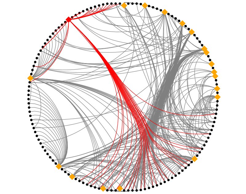
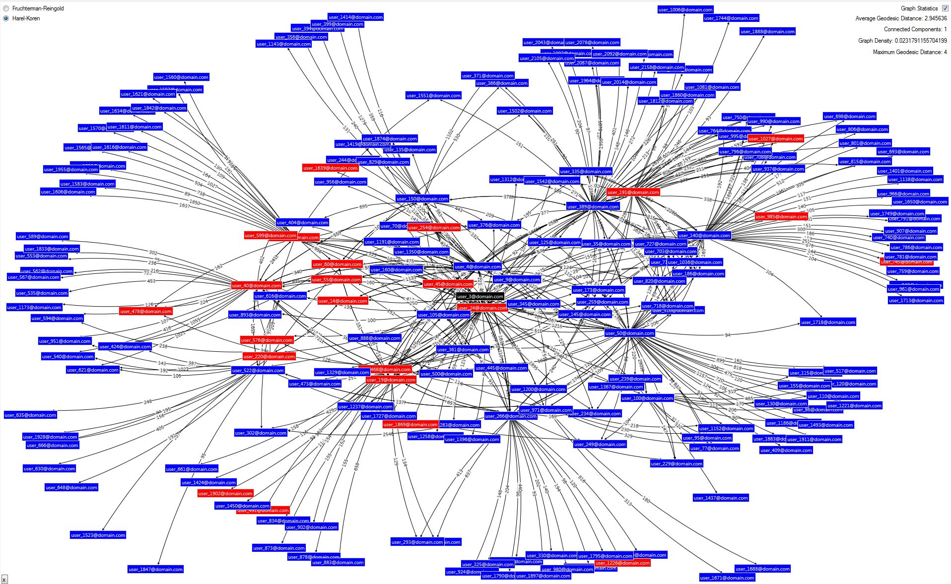
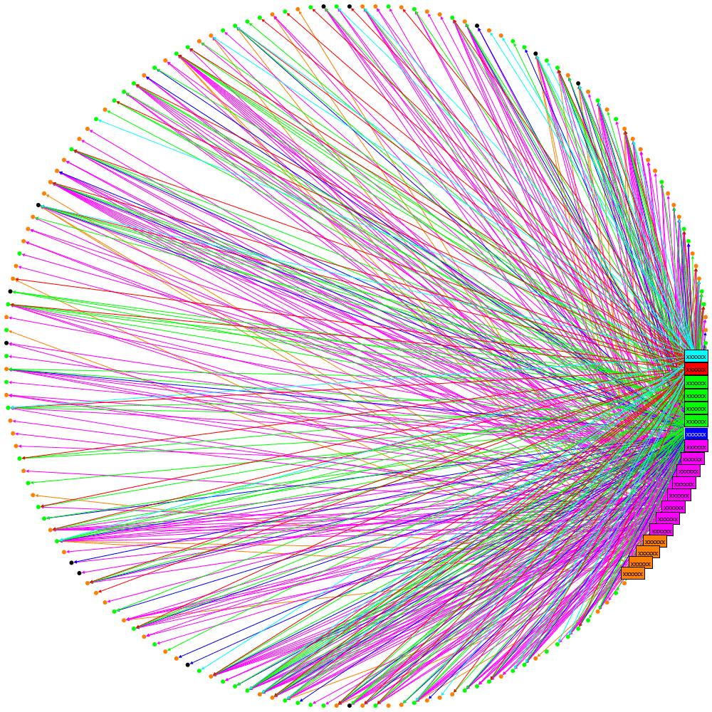
Showing someone a graph of where they fit into an organisation along with over 2000 colleagues is simply not practical, not only can’t it all be fitted on a screen at a meaningful level but it’s just going to be a mess of edges (connections).  I previously described loading SNA data first into a relational database and then into Neo4j. The structure I have built in Neo4j is quite simple: a node (person) has a number of attributes including email address and languages which is a list of languages a person speaks (people provide this information to the corporate directory). The edges in Neo4j have a single attribute, score, which attempts to represent the relative strength of the relationship between two people (nodes). The score is derived from a number of data sources I have previously described.

So here’s the scenario I’m looking at: let’s say you need to find someone who speaks German;  the corporate directory can be searched on a number of attributes including language but what if you don’t know any of the people who speak German and you don’t really want to approach people you don’t know. Well this is where your friends of friends might be able to help but how do you know which of you friends may know one of the people who speak German. Well this is perfect territory for graph databases.

To query Neo4j firstly I’ve enabled auto-indexing for the email and languages attributes (along with others); this is done by editing the neo4j.properties file in the conf folder:

neo4j-auto-index

Then, using the Neo4j’s cypher query language execute the following (I’m rather proud of this Cypher query but I’m sure a Cypher expert might be able to put me right):

START
n=node(*), m=node:node_auto_index(email = ‘[email protected]’)
MATCH
p = allShortestPaths( (m)<-[r*..6]->(n) )
WHERE
n.languages =~ ‘(?i).*german.*’
RETURN DISTINCT
length(p) AS len,
EXTRACT( n IN NODES(p):n.email) AS email,
EXTRACT( r IN RELATIONSHIPS(p):r.score) AS score
ORDER BY
length(p)

Let’s take that apart:

  • START: defines two sets of nodes: n is all or any node, m uses the query to locate the node that matches the email address of the user making the query
  • MATCH: the allShortestPaths is a built-in function that does exactly what it says, its argument restricts this to a maximum of six hops and between the two sets identified in the START clause; it returns a list of paths, referred to as p. (A path contains the both nodes and edges, e.g. you get Node1–Edge1->Node2–Edge2->Node3). Every path will connect a node n (the German speaker) to node m (the user making the query) and include up to 4 intermediary nodes.
  • WHERE: this reduces the size of set n (remember this is node(*) ) to only those that have a language attribute matching the supplied regular expression (the fiddly bits just means ignore the case)
  • RETURN: there will be three things returned:
    • the length of the path,
    • a list of all the nodes in the path
    • the ‘score’ values between each pair of nodes
    • ORDER BY: shortest paths are best (usually, more of that next), so the ordering is by the path length

Now shortest paths are best, right? Well maybe but from the work I’ve previously described there is a score for every relationship (edge), is a short path with low scores better than a long path with high scores? Well I don’t know and I’d love to hear from anyone who’s read a paper on the subject or has any views. The following illustrates this, the capital letters represent a node (person) and the number in brackets is the score of the relationship between the two nodes. A is the user making the query and X speaks German, there are the following paths:

Path 1: A–(350)–B–(193)–X

Path 2: A–(5)–C–(9)–X

Path 3: A–(150)–D–(210)–E–(105)–X

Clearly the first is pretty good: the path is short and the relationships are relatively strong. But what about the next one, the path is short but A does not know C that well and, likewise, C does not know X well; it may be better to go via D and E, although the path is longer everyone on it probably has a strong relationship.

Having experimented empirically I found a good result is obtained by ranking the paths based on the lowest relationship score in the path (think of this as the ‘weakest link’), the above three paths are ordered thus (I have highlighted the ‘weakest link’ in each):

Path 1: A–(350)–B–(193)–X

Path 3: A–(150)–D–(210)–E–(105)–X

Path 2: A–(5)–C–(9)–X

Results with this ranking appear to work very well; in general shortest paths tend to feature and longer paths with high scores are rarer because, of course, it only takes one weak link to demote it in the rankings.

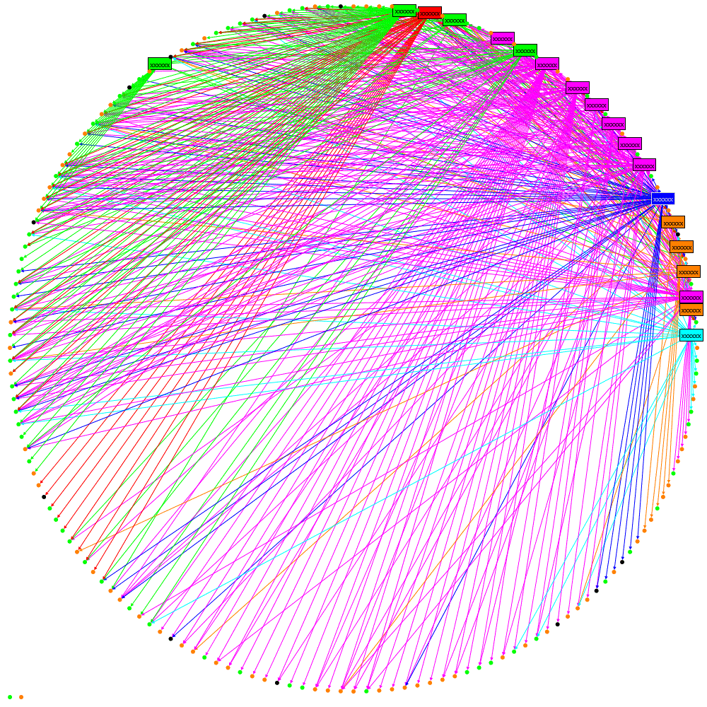
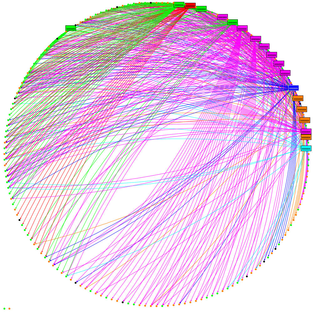
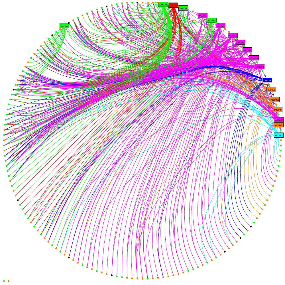
The ranked paths can be presented to the user but there is often a lot of redundancy, it could be that Path 3 is repeated but going through node F instead of E. Therefore I’ve found it better to turn the list of paths back into a graph. I’ve used a visualisation component from the excellent NodeXL library to do this. I’ve also limited the number of paths displayed as too many produce a somewhat unreadable result; this is why ranking the paths was important, we want to display the best ones if we can’t display them all.

knows-languages

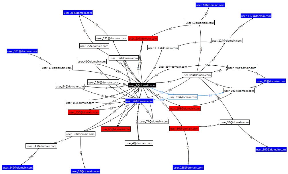
The black node in the centre is the user making the query; blue nodes are people who can speak German; white nodes are intermediaries. The red nodes represent people who have left the organisation, they aren’t really that useful here I just haven’t got round to adding an option to filter them out. Each relationship (line) is labelled with the score (strength).