An organisation wanting to get its message out through social platforms needs to understand the relationships between the organisations tweeters and their followers. For example how much overlap is there or how many target twitter followers would be totally lost if one of the organisations tweeters was lost. Whilst it’s easy to obtain the basic information about followers and analyse this in tabular format it would be nice if there was a visualisation that convey this information in a more digestible format. Step forward the circular layout:
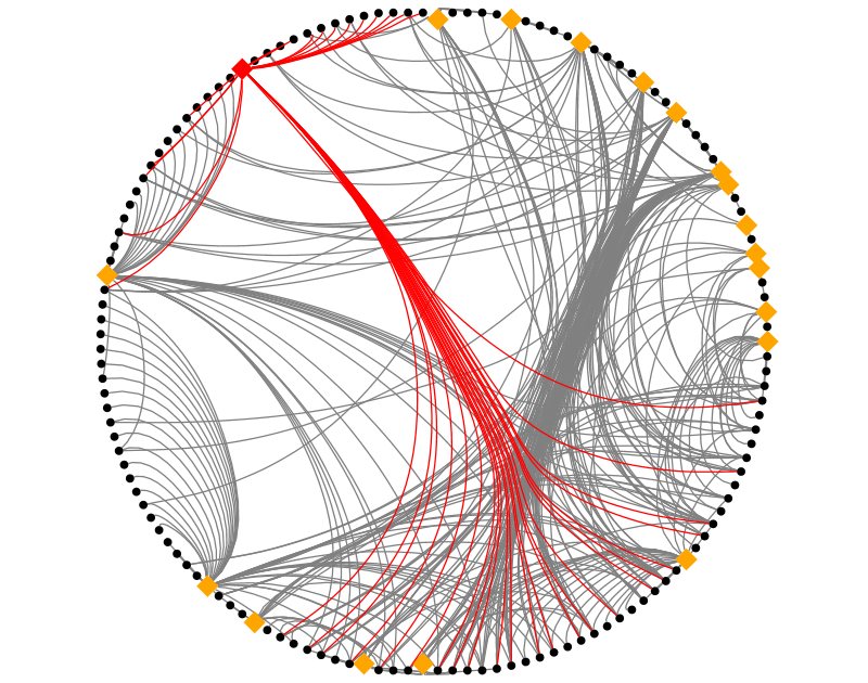
This visualisation was created with NodeXL using the circular layout and bundled edges. The orange diamonds are the organisations’ tweeters and the black circles are followers. One tweeter has been selected and their followers highlighted, in red. The following observations can be made:
- There are a number of followers who only follow one of the organisations’ tweeters (look at 7 – 12 o’clock)
- The thickest bundle of connections identifies a number of the organisations’ tweeters with a significant overlap of followers (look at 2 o’clock and 5 – 6 o’clock)
- The tweeter highlighted in red has a mix of unique and shared followers.
These observations can be used by the organisation to consider how best to get its message to target followers.
 Follow
Pingback: Circular Layouts, Binning and Edge Bundling | Robert Gimeno's Adventures in Data Science
Pingback: Mapping the Graph of Retweets | Robert Gimeno's Adventures in Data Science