Tag Archives: gephi

SNA Quick Win: Outsourcing Organisational Design

When entering outsourcing arrangements many organisations like to bring in the role of “Relationship Manger” which is supposed to act as the interface, or at least an initial broker, between the two organisations. Each party tends to have these roles and the amount of informal communication that does not travel via these roles varies depending on the levels of trust and formality. The question is how many people should be in these roles and between which groups in the two organisations should they be placed?

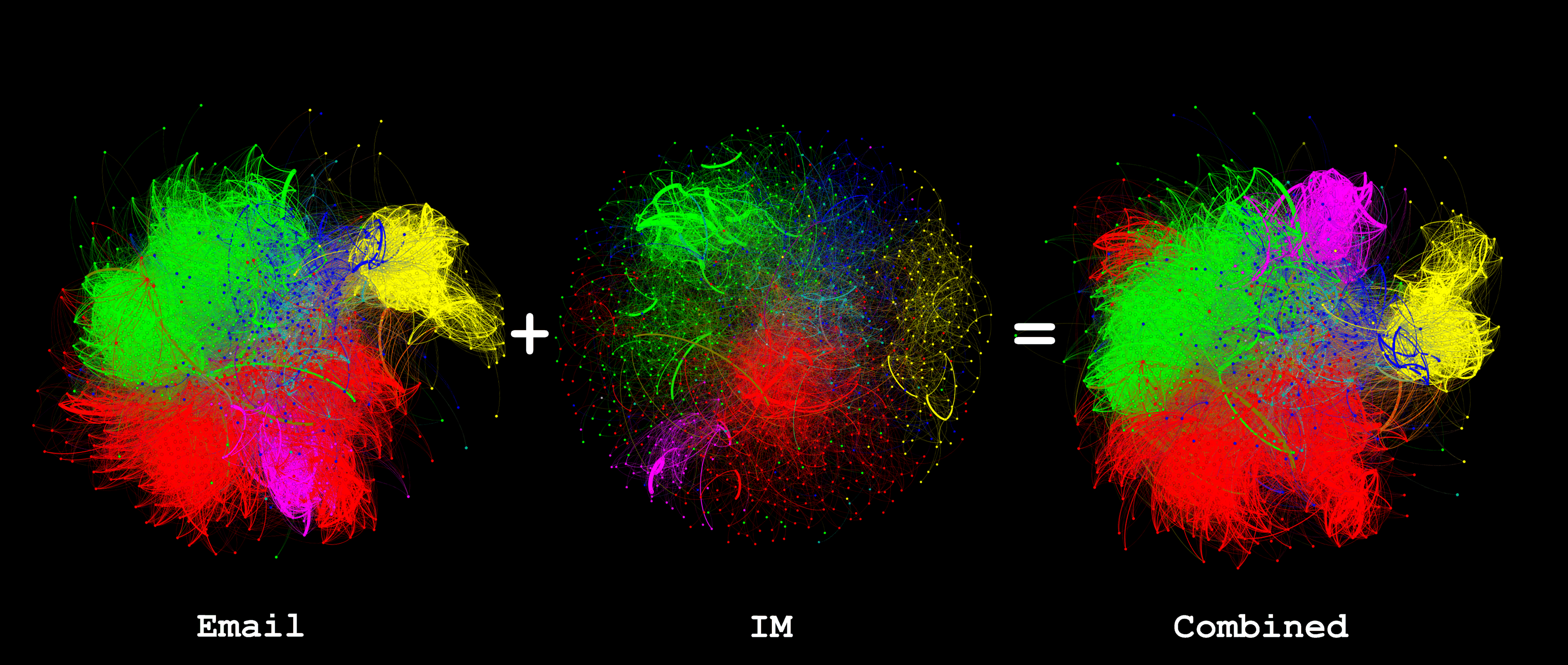
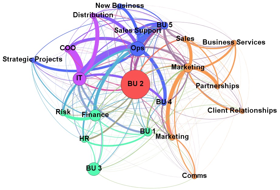
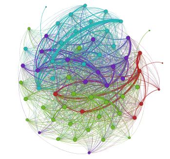
Looking at the original organisation, prior to outsourcing, some simple SNA tools can help: by measuring the communication between the two groups (retained and outsource target) it can be seen who the key people are bridging the groups and the volume of that communication. Using a tool, like Gephi, and running a layout such as Fruchterman-Reingold this can be visualised as shown below:

borderGR

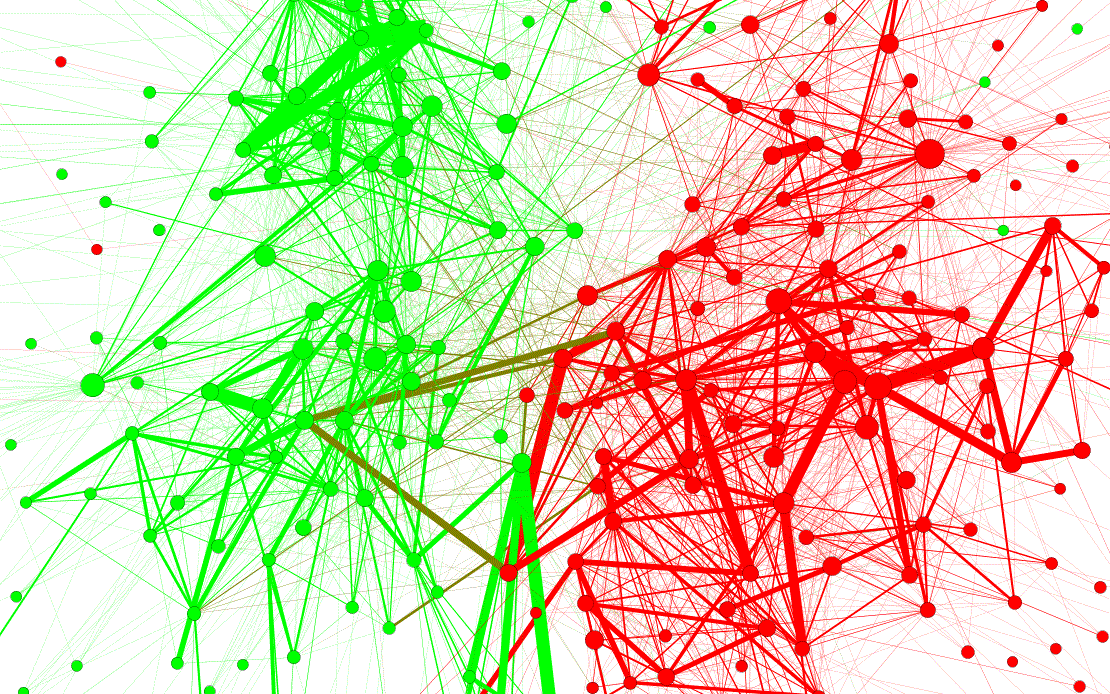
Note in the centre there are some individuals with strong ties between the two groups, this would be a prime place to consider placing relationship managers. There are also another couple of interesting observations: (1) there are a lot of less strong relationships between individual in the two groups which, taken individually, might not seem significant but when added up are significant and must be considered; (2) some individuals appear to be in the wrong group (e.g. the red dots amongst the green dots) and their allocation to the ‘retained’ or ‘outsource’ group should be reconsidered.

Email vs. Instant Messaging for Social Network Analysis, Round 3

Making the most of available data within an organisation needs to balance the effort of obtaining and analysing the information against the value derived from that information. I’ve been looking to see if IM data is worth collecting when an organisation has already collected email data. The following graphic shows social networks based on Email, IM and then combined data, each colour represents a department in the organisation being studied:

2013-06 to 2013-07 Email plus IM

Visually the following can be observed:

  • Email is much more heavily used than IM and gives a more complete picture of the network
  • The result of combining Email and IM shows that the email structure dominates but, as one can see, the department coloured magenta () has moved from neighbouring the red () department to neighbouring the green () department. At this time I don’t have an explanation as to why such a dramatic change is seen but I will be investigating.

But what do the numbers look like? The following graph metrics were calculated using Gephi:

Email IM Combined
Average Degree

71.672

15.682

74.263

Avg. Weighted Degree

1722.546

705.802

2331.18

Network Diameter

4

7

4

Graph Density

0.054

0.014

0.056

Modularity

0.661

0.689

0.667

Avg. Clustering Coef.

0.395

0.261

0.391

Avg. Path Length

2.281

3.115

2.252


Adding in the IM data has increased Average Degree from 71.6 to 74.2 and Graph Density from 0.054 to 0.056; this shows that it has identified relationships that email did not and, therefore, does enhance the pure email graph.

If using the graph to identify the strength of relationships or influence the next question is what weight to assign to IMs compared to email? My initial thought was that an IM contains much less than an email so would be worth an order of one-tenth of an email. However measuring the average degree of IMs (16) it seems that people are more reserved in who they communicate with using IMs and, presumably, have a closer relationship. Therefore I have equated one IM message with one email message.


Chord Diagrams

Circular layouts work well for individual to individual visualisations but for group to
group (such as departments in an organisation) where there is close to a fully
connected graph chord diagrams seem to offer a clearer layout. The following
diagram shows the same data for the volume of communication between
departments. They don’t quite show the same thing: the circular layout’s nodes
are proportional to the size of the department whereas the chord is based
purely on the volume of communication.

circular vs chord

The circular diagram was created with the circular layout plugin in Gephi; the chord diagram is adapted from this article and uses the ds.j3 library which means it’s interactive in the browser.

Cutting it down to size – summarising the graph

Showing someone a view of their organisation of over 2000 people rendered in Gephi might produce an initial ‘wow’ but they can then struggle to make sense of it. A better approach might be to summarise the information by amalgamating the nodes into departments (or whatever organisational unit is meaningful). The following graph shows the organisation I have illustrated before but broken down into ‘departments’, the sizes of the nodes are proportional to the number of people in the department and the widths of the edges are the totals of all the weights from each underling edge between two groups of underlying nodes. To amalgamate the data I created a query that assigns each node ID (from the underlying SQL database) to a group which is then used to summarise data using in-memory hash tables; this has the advantage, over a SQL ‘group by’ clause, of creating arbitrary groups independent of the fields in the select clause.

Departments

Looking at the graph you can immediately see strong ties between IT and Ops but BU 2 looks a bit isolated given its size.

Value in IIS Logs

Dependency Discovery

For organisations using Web Services on Microsoft Servers the IIS logs can prove a useful resource. Firstly it’s possible to build a dependency map showing which servers are dependent on services on a given server. Using the Gephi timeline feature it’s also possible to show how the traffic changes over the course of a day, or whatever period. The Gephi graph below shows data collected from a number of servers over an 18 day period. The edges have been weighted with a logarithm of the number of calls received per minute. The colours represent clusters detected by Gephi and not derived from any information about the server. Now you might think an IT department will know all the dependencies between servers; well maybe it should but this exercise did reveal a few surprises and even if it did not it is still a worthwhile exercise to validate dependency information.

IISdependencies

Deviance Detection

Log files can be used to automatically create a baseline of ‘normal’ behaviour. This can then be compared with current behaviour and anomalies identified. A simplistic approach is to calculate an average of calls to a web server historically and then compare with the number of current calls. The chart, below, shows this for one server: the blue line is the average number of calls per minute of the day from days 1 to  17; the red line is the number of calls received each minute on day 18

IISperformance

Social Network Detection

All very interesting but can IIS logs help build a picture of Social Networks? Well I’m not sure as I’ve not tried but it lets you see who used what and when, well certainly for internal apps. People who use the same app around the same time or with similar usage patterns are probably doing a similar job so may know each other and, if they don’t, maybe they should.

Departmental Factions

communities

A colleague said to me today ‘oh that department has a number of factions’. Hmmm, did the data reflect this….I loaded data for just that department into Gephi (the data combined email, meetings, projects and hierarchy to deduce the social network). I ran Modularity and sure enough four partitions popped out. My colleague took a look at the names in each partition and said ‘yeah, looks about right’.

Here is the Graph coloured by the community detected (anonymised).