Category Archives: Social Network Analysis

Cutting it down to size – summarising the graph

Showing someone a view of their organisation of over 2000 people rendered in Gephi might produce an initial ‘wow’ but they can then struggle to make sense of it. A better approach might be to summarise the information by amalgamating the nodes into departments (or whatever organisational unit is meaningful). The following graph shows the organisation I have illustrated before but broken down into ‘departments’, the sizes of the nodes are proportional to the number of people in the department and the widths of the edges are the totals of all the weights from each underling edge between two groups of underlying nodes. To amalgamate the data I created a query that assigns each node ID (from the underlying SQL database) to a group which is then used to summarise data using in-memory hash tables; this has the advantage, over a SQL ‘group by’ clause, of creating arbitrary groups independent of the fields in the select clause.

Departments

Looking at the graph you can immediately see strong ties between IT and Ops but BU 2 looks a bit isolated given its size.

Combining Data to Weight Social Connections in an Organisation

SNA Data Sources

In the above diagram red nodes are from the division of the organisation under study; green and blue are from two other divisions and grey nodes are uncategorised or central functions.

I’ve previously described determining a ‘score’ for social connections taking data from email, meetings, directory and timesheets. The question is how to combine them to produce as complete a picture as possible from the data at hand. I’m fairly sure the best answer is not to simply add the scores together but I’ve not found any guidance that would help do anything except that so that’s exactly what I have done…add them up. To summarise the score (or more correctly weight) given to each edge is made from:

  • 1 point for each email exchanged (where there are a maximum of 10 recipients)
  • 1 point for each minute in a one-to-one meeting, reducing rapidly as the number of attendees in the meeting increases
  • 300 points for being in a manages/managed by relationship
  • 1 point for every hour spent on a project divided by the number of people on the project

I’ve pulled this data together over the following periods:

  • Email: 6 months
  • Meetings: 2 years, 3 months
  • Corporate Directory: 6 months (but this is very slow to change so probably reflects the vast majority of the last 2 years)
  • Projects: 1 year

The coverage of the data also varies:

  • Email: for the core of the organisation being studied this is excellent as the data comes from Exchange Server Logs, for the periphery there is limited coverage as only emails being exchanged with the core are captured
  • Meetings: probably less than 50% as not all rooms are visible and not all meetings are booked in rooms; also teleconference information is not captured
  • Corporate Directory: very good, 90%+ but data is limited to corporate hierarchy
  • Timesheets: good but the system is not used universally as not everyone works on projects.

Some Observations using this approach:

  • Email dominates the structure of the network, the others add very little for those in the core; however for those outside the core the others provide additional insight into the structure.
  • There is overlap in these sources, for example we expect a manger will share emails with their reports and that people on a project will have meetings together but, as the coverage of each source is not compete, this is a small price to pay for seeing the whole network.

Despite the rather simplistic approach the results appear to work quite well but I’d love to hear from anyone who has implemented, or read about, a smarter way to combine these types of SNA sources.

Beyond Email: Timesheets

The final source of social network data I have actively exploited is from a time recording system. These are going to vary widely between organisations and the one I’ve worked with has been quite fiddly to manipulate so I won’t go into too much detail. What I’d like to describe is how I’ve derived the ‘score’:

  1. Extract a list of projects
  2. For each project find the number of people who have booked time to it
  3. Find every pair of people who have booked time to each project
  4. From the pair of people take the lowest number of hours booked to the project
  5. Divide the lowest number of hours (4) by the number of people on the project (2)

The reasoning here is that the number of hours booked to a project by any given person has to be shared-out amongst all the other people in the project. Unlike meetings, where I used minutes as part of the formula here I use hours because working on a project does not imply necessarily spending lots of time interacting.

Value in IIS Logs

Dependency Discovery

For organisations using Web Services on Microsoft Servers the IIS logs can prove a useful resource. Firstly it’s possible to build a dependency map showing which servers are dependent on services on a given server. Using the Gephi timeline feature it’s also possible to show how the traffic changes over the course of a day, or whatever period. The Gephi graph below shows data collected from a number of servers over an 18 day period. The edges have been weighted with a logarithm of the number of calls received per minute. The colours represent clusters detected by Gephi and not derived from any information about the server. Now you might think an IT department will know all the dependencies between servers; well maybe it should but this exercise did reveal a few surprises and even if it did not it is still a worthwhile exercise to validate dependency information.

IISdependencies

Deviance Detection

Log files can be used to automatically create a baseline of ‘normal’ behaviour. This can then be compared with current behaviour and anomalies identified. A simplistic approach is to calculate an average of calls to a web server historically and then compare with the number of current calls. The chart, below, shows this for one server: the blue line is the average number of calls per minute of the day from days 1 to  17; the red line is the number of calls received each minute on day 18

IISperformance

Social Network Detection

All very interesting but can IIS logs help build a picture of Social Networks? Well I’m not sure as I’ve not tried but it lets you see who used what and when, well certainly for internal apps. People who use the same app around the same time or with similar usage patterns are probably doing a similar job so may know each other and, if they don’t, maybe they should.

Beyond Email: Corporate Directory

I’ve already discussed the corporate directory when it comes to enriching email data. It also contains information that can help build a picture of the social network. Specifically the line manager relationship is held in a typical corporate directory.  If you have imported the directory like I did then there is no more to do as the employee ID and manager ID are already there. I’ve also kept historical management structure relationships on the basis that a line management period will build a relationship that tends to persist.

Martin House pointed me to an interesting paper which contains a diagram overlaying the corporate structure (from the directory) with the social network revealed by emails, looks pretty neat, must have a go at creating one.

Effectiveness of Large Meetings

The previous discussion of Dunbar’s number suggests larger meetings will be less effective. Is there any data to support this? The following chart shows emails sent during meetings:

meeting_email

Seems to suggest the larger the meeting the less attention people are paying but not a particularly remarkable result. I expect looking at instant message traffic during meetings would be more revealing.

Beyond Email: Meetings

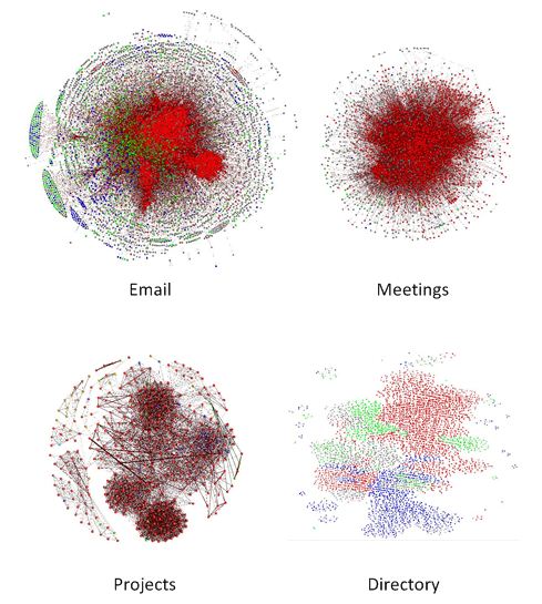
The next data source you may have in your organisation also comes from Microsoft Exchange Server. If you use Exchange Server to book meeting rooms then this can be mined. As always what can be accessed will depend on your organisations privacy policies. In the organisation I describe here I have access to the calendars for well over half of the meeting rooms using my standard authentication credentials because I am allowed to book meetings in these rooms. Through the room calendar I can also see when other people have booked meetings; it’s not possible to see the meeting subject but it is possible to see a list of attendees. Unlike email I have accessed the meeting room calendars through the Exchange Server API; this is described by a number of others so I won’t reproduce it here, search for ‘Microsoft.Exchange.WebServices’ and ‘GetRoomLists’.

Meetings differ from email in that they are a many-to-many event rather than on-to-many. There will be a meeting organiser but this is often a PA so I do not give any special meaning to them. Just as with email I prefer to load data into a relational database first, the table structure is shown, below.

meetings

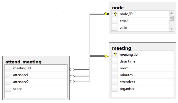
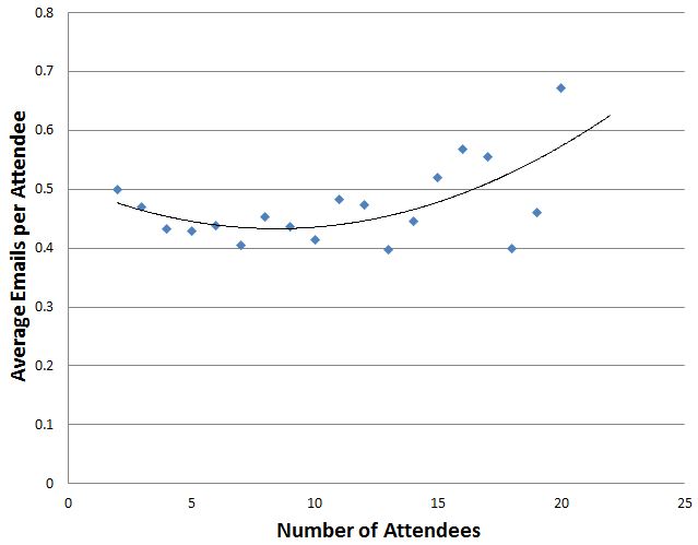
You’ll notice that the table attend_meeting has a field ‘score’; this table has an entry for every pair of attendees at the meeting but how to give each pair a score? Starting with the premise that a two-person meeting means each person is receiving the full attention of the other  I need to find a way to reduce this score as the number of attendees increased and I found the following seemed to be a good fit:

score = minutes / ( n * ( n -1 ) / 2 ) where n = number of attendees

The table below shows the scores for a 60 minute meeting

Attendees, x=(n * (n -1)) / 2, minutes/x
2         1                    60
3         3                    20
4         6                    10
5          10                   6
6          15                   4
7          21                   3
8          28                   2
9          36                   2
10         45                   1

After 10 attendees the score is always set to 1

I found an interesting discussion of Dunbar’s Number in ‘Connected: The Amazing Power of Social Networks’ by Nicholas Christakis which suggests the maximum effective meeting size is 3.8 (OK let’s call it 4) which seems to support the fairly rapid degradation of the importance of a meeting  (as a social network building tool) when the number of attendees increases. If you check out the book at Amazon http://www.amazon.co.uk/dp/0007303602/ and look at the preview you’ll see the discussion on page 249.

Side Effects: Making Friends with your Exchange Server Administrator

I’m no Exchange Server expert, maybe there are some better built-in or downloadable
tools for doing what I describe here, but if you’ve loaded emails into a
relational database, as I’ve described previously, the following is extremely
simple. In arranging to get log files from the Exchange server I asked the
administrator if there was anything they wanted to know about that the logs
might reveal and, indeed there were: it turned out they wanted to know who was
sending the most email as storing it all was becoming more and more of a
problem. After trying a few different ways of reporting on the logs we settled
on the following: every time new logs were taken (about every 2 weeks) two
queries are run: the first extracts the top 100 sender-to-recipient traffic by
email count and the second extracts the same but by total message size (which
is why I capture it). Quite often the culprits were system accounts including
one that went a bit mad and sent 300,000 emails in 72 hours! Using these
reports the Exchange administrator has managed to work with development teams
to reduce the number of mails being generated by applications that it seemed no
one was reading.

Email Hints & Tips

When working with email there are a few things that can trip you up, here are some tips for avoiding them:

  • Always turn email addresses into a consistent case; I prefer lower but the choice is yours. Oh and get rid of any leading or training spaces, you shouldn’t get any from the Exchange message tracking logs but make sure by trimming anyway.


  • Use an integer ID as primary NOT the email address; email addresses can change over time and there will often be duplicates; using a key other than the address makes it easier to merge addresses when duplicates are detected (through an email aliases table)


  • Ignoring broadcast emails: sometimes you may see an email sent from the CEO to everyone in the organisation – is this really indicative of a relationship, probably not. In fact any emails sent to more than a small group probably don’t give much indication of a social tie. There are a couple of options:
    • Ignore emails sent to more than n people; what in is up to you, I’d say around 10
    • Use a formula to exponentially reduce the social network significance assigned to an email as the number of recipients increases. I’ll say more about this approach when I discuss some other sources of data.


  • Ignoring system/technical accounts: you might see emails sent from non-personal accounts, e.g. “[email protected]” and these should probably be ignored as they are usually just a broadcast of information revealing no social ties. How do you spot them? If you are lucky then they may not conform to the same pattern as personal emails (e.g. “firstname.surname@domain .com” versus “[email protected]”) or you’ll have to construct a list; in my experience both were used, the pattern match caught most but there were a number of exceptions that had to go into a list, you just have to keep an eye out for them.

The Exchange server logs contain a message size. I have not yet found any use for this in understanding the social network but it’s useful to have when making friends with the Exchange server administrator, see my next article!