Author Archives: Robert Gimeno

Prediction – Don’t Give Up

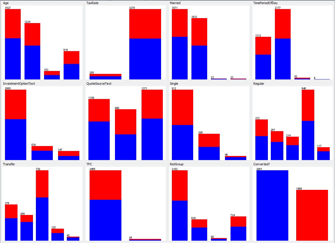
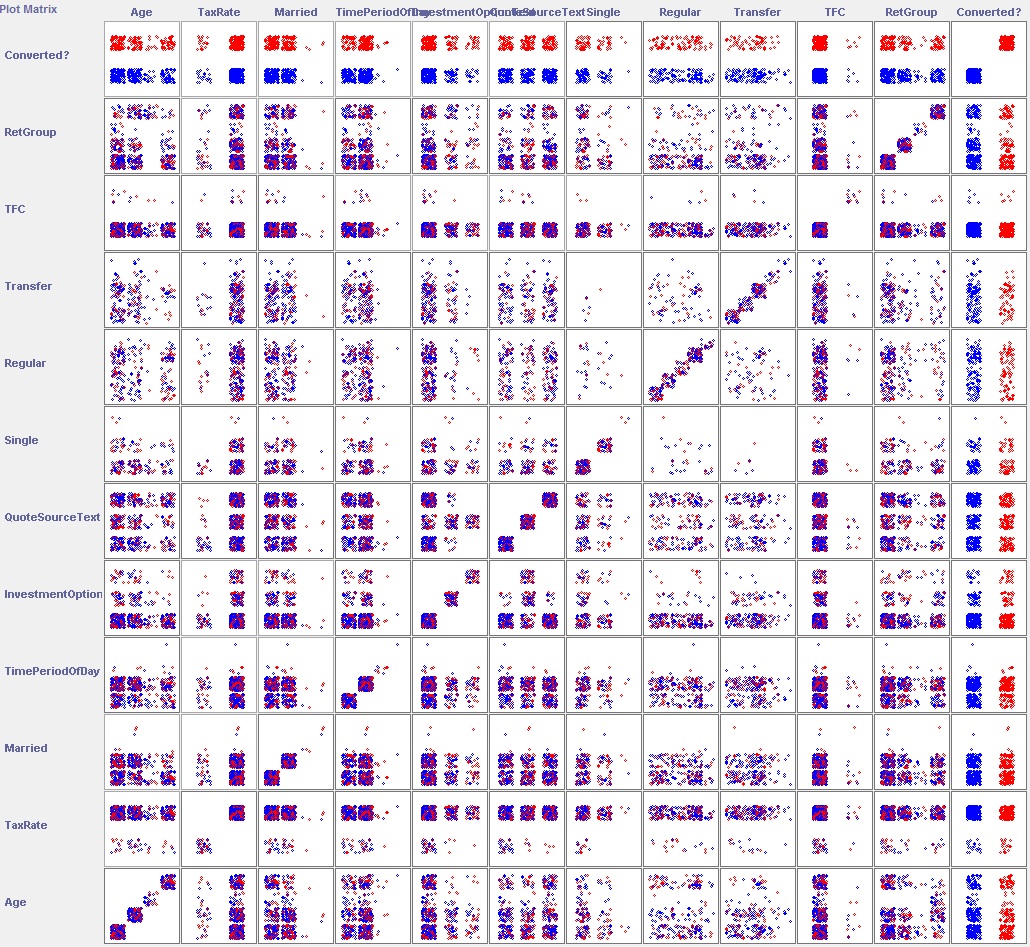
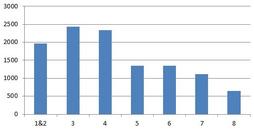
I previously described a dataset that was stubbornly refusing to yield any predictability. Using a larger set of the same data I realised that rather than trying to predict an individual opportunity to sell what was actually of interest was is a particular lead likely to become a customer (most people don’t buy multiple products of this type and there is often a number of interactions with each customer before a sale). By focussing on customer it became clear there were some noticeable distributions amongst the parameters. The dataset was very nicely split 50/50 between successful and non-successful opportunities and the best predictors were able to correctly classify almost 70% of cases. The most accurate predictor (highlighted) was the time between the first and ultimate opportunity with that customer – probably not the most useful as it could be argued as customer coming back after a reasonable period has thought about the product  and decided to proceed.

Weka Parameters 2012 Set

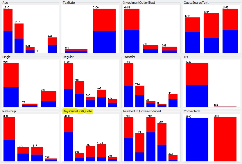
Whilst the mathematically best predictor might not be that useful in the business setting there are some other parameters that show noticeably useful predictive capabilities.

Is 1.66 the cosmological constant of Email?

After 6 months of colleting email data it should be possible to spot trends and variations. Some variations, mostly around holiday periods are quite obvious but trends have not been so obvious. One measure in particular has been remarkably constant: the average number of recipients per email. The following plot shows this average over the last 27 weeks for approximately 2,000 people and 10,000,000 emails:

recipients per email

The average across the entire period is 1.66. The only noticeable variation occurs during the Christmas holiday when the organisation is almost completely closed.

Compare this with a couple of other averages:

emails per unique sender

MBytes per unique sender

That last one, which effectively shows the average size of emails, is interesting in that there is a peak immediately following the end of the Christmas holiday; this could be interpreted as a build-up of information suddenly being released or it could be because there is a lot of ‘set-up’ information sent around at the beginning of the year.


Prediction: not all that easy?

Predicting if a potential sale is converted into an actual sale, based on a information about the potential sale, is a classification problem. We are trying to classify each potential sale into a ‘converted’ or ‘not converted’ class. However its not always going to be possible. The following set of graphs show Weka’s pre-processing parameters plot:

Weka Parameters

The final graph (bottom right) shows the outcome from the training data that has been captured: blue indicates ‘not converted’ and red indicates ‘converted’, the ratio is approximately 40% converted and 60% not The preceding eleven graphs show various parameters (e.g. customer’s age category or product variant); each category within the graph is a stacked bar showing the converted and non-converted ratio for that subset. Visually it can be observed that the ratios of converted to non-converted are fairly consistent across all the parameters; there are a few exceptions but these are all in the much smaller subsets. This is not a promising start, could a combination of two parameters be the answer? Weka allows us to visualise each pair of parameters with a plot matrix:

Weka Plot Matrix

If any combination of two parameters were a good classifier then we would start to see asymmetrical distributions of the colours in the plots at the intersection of those parameters. Note the top and right rows are the parameter being predicted which is why the colours clearly separate into a row or column – effectively these are what was shown in the previous group of charts.

Maybe three or more parameters would produce a good classifier; to achieve this visually some more dimensions would be needed but this is not going to work beyond at most 3. Fortunately there are numerous classification algorithms, many of which have implementations in Weka, which will handle multiple parameters. Unfortunately for the dataset in question no classifiers produced a reasonable result  so it would appear the parameters selected (because they were readily available) do not have a measurable influence on outcome.

Prediction

Leaving behind email data for a while another set of data my organisation collects represents potential business. Using Weka I have started to investigate if conversion of the potential business to actual business can be predicted. I have a sample of 11,000 recent prior cases and know if they have led to business (‘converted’) or not. 41% converted and 59% did not. Using some summary level data I have tried a number of classification algorithms. Many of these reported approximately 60% correctly classified instances (which is not very good considering always predicting a ‘No’ is 59% correct). The best gave 70%-75% but on further investigation (of those where enough information was provided) this was due to over-fitting: this was particularly noticeable for rule-based algorithms which where generating up to a few-hundred rules.

What is the distribution of emails sent from one rank to another?

Whilst it appears higher ranks tend to send email downwards and lower ranks upward for a more detailed view it is possible to plot, for each rank, to which other ranks email is being sent. The plots are shown below:

Email_detailed_direction_by_rankJPG

Looking at these plots it can be seen ranks 0-4 send more email to the rank below than any other; ranks 5-7 send more email to the same rank than any other and only 8 sends more upwards (mostly to 6 and7). It can also be observed that the ranks to which email is sent are fairly tightly packed around the sending rank. Without other organisations to observe it difficult to make sweeping generic statements but I think this shows a lack of ‘mobility’ between the ranks and suggests a command-and-control mentality.


Is there a difference in the direction of email for different ranks?

After looking at the overall direction of email the next question is does this vary by rank? The graph below shows the direction of email by rank; as might be expected rank 0 (the most senior) can only send to lower ranks (there is only 1 rank 0) and rank 8 cannot send downwards. In-between the shape of the curve is remarkably well behaved; I would say this does not show much bias at any rank, considering their position:

Email_to_rank_by_rank

Does email get directed down, up or sideways?

Having asked who is sending all the email and who’s receiving it another simple statistic is the percentage of email directed upwards, downwards or sideways in the hierarchy. The following pie chart shows the breakdown of comparing the rank of the sender to the rank of the recipient (for each recipient of the email):

Email_to_rank

Sample size: 10 million

Who’s receiving all that email?

I previously asked who was sending all the email; well the next question is who receives it all? Once again the middle management features highly but then so do the senior managers. This sort of result is probably what I would expect thinking about the roles these groups perform but is this typical of most organisations?

Email Received

Average emails received per person, grouped by rank.

Who’s sending all that email…it’s the middle management!

This is a pretty simple metric to look at but might be quite revealing to your organisation. I’ve matched the sender of an email to their rank derived from the corporate directory. The rank is their position from the top of the directory e.g. A manages B manages C – if A is at the top of the directory then A=1, B=2 and C=3; this approximates their grade and roughly those ranked 1-2 are senior executives, 3-4 are middle management and 5+ get to do all the work. The chart shows the average number of emails sent at each rank over a number of months. Ranks 1 and 2 are combined because rank 1 is a very small sample.

Email Sent