Author Archives: Robert Gimeno

Mapping the Graph of Retweets

In the pre-print book Twitter Data Analytics section 5.1.1.1 ‘Retweet Network Fallacy’ describes the problem that with a retweet you can only tell who the original tweeter is and not the network through which it propagated.

I’ve been doing some work on using retweets to help understand the strength of connections in a social network, you can see some early results here and this is an issue. I believe this can, at least partially, be resolved by using follower data.

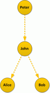
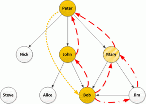
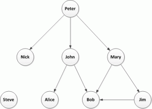
I’ve previously discussed Twitter Followers and I don’t think this concept takes too much explanation. Here is a simple example of a followers network: Peter is followed by John who is, in turn, followed by Alice and Bob, etc.

retweets_1

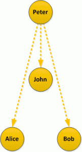
Now let’s look at the problem described in Twitter Data Analytics, retweets: in this simple example Peter is retweeted by John who is, in turn retweeted by Alice and Bob

retweets_2

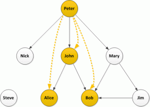
But if you look purely at retweet data returned by the Twitter API you will see this:

retweets_3

It appears that John, Alice and Bob retweeted Peter; the structure of the network is lost.

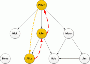
Let’s look at this again with the retweets overlaid on the followers network:

retweets_4

How does this help? Well firstly load the follower network into a graph database and then take a look at each retweeter. Graph databases are excellent at searching relationships and finding paths, so starting with John and Alice:

retweets_5

In this simple case there is a single path from John back to Peter with no intermediate nodes, it’s quite likely John directly retweeted  Peter. The only path from Alice back to Peter is the one through John (and we know John retweeted) so it is quite likely that Alice saw the retweet from John and retweeted that.

Now humans, being complicated things, make complicated social networks. Let’s take a closer look at Bob:

retweets_6

There are multiple paths from Bob back to Peter and we could take the following strategies: look at only the shortest paths, look at all paths, or set a limit on path lengths (if we set a limit of 2, also the shortest, we will only identify the paths through John and Mary but not Jim). I would suggest, if possible, looking at all paths but this will have performance consequences for very large graphs.

The next question is do we want to look at all the tweets from Mary and Jim to see if they also retweeted the original (this can be an expensive operation – in API time or if buying tweets)? If not then we don’t know the actual path but can estimate the likelihood of each path having been taken perhaps with the shortest being more likely (I’m not exactly sure how the maths has to work here…help me out), or maybe there is some historical data we have about existing paths.

If examining each person’s tweets then consider the following possibilities, from the above example:

  1. Only John retweeted: the path is most likely via John
  2. John and Mary retweeted: it’s equally likely to have come via John or Mary, unless there is some historic data suggesting stronger existing ties to one of them
  3. John, Mary and Jim retweeted: well I’m not sure, are the shorter paths more likely, I guess they are as they would have placed the retweet on the users timeline first but the path through Jim cannot be completely dismissed, I’m wondering if infer.net could help here?

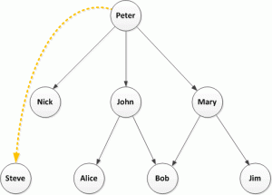
Finally consider this:

retweets_7

Well who knows? Maybe there are some protected Twitter accounts or maybe Steve picked this up because of a hashtag, which is a whole other topic.

Has anyone out there already answered these questions, please get in touch?
 

Key lessons for getting started with social data analysis

social-data-week-logo-colour

Some guidance from the #SDW13 London panel on how to get a social data project running successfully:

(1)    Map the social Data ecosystem: what are the data sources; who are the users; who will analyse the data; what data is important?

(2)    Get an early client (internal or external) and iterate quickly.

(3)    Build slowly and try not to over-think it; generate some early value.

Apparently some of these were learnt the hard way, so pay attention!

When a social network knows it is being watched does it change?

cctv-camera

There is tremendous value in analysing social networks, both internally to an organisation, and looking at the social networks of the organisation’s customers, suppliers, industry influencers etc. but what happens when that community becomes aware that their publications and interactions are being analysed?

I asked this question at Social Data Week ’13 in London  and the panel’s answer was that it did: you can already observe people taking advantage of this in expecting some sort of reward for following, or otherwise being associated with, organisations. This sounds fairly innocuous but I am more concerned about observing networks inside the organisation.

Think about the following scenario: an organisation analyses IMs to gauge sentiment and presents this information by department; one department noticeably has a lot of negative sentiment compared to the others; the department’s manager is advised of this and asked to devise and implement a plan to improve the situation. What could they decide to do, the three options are:

1         The right thing: find the root causes and address them

2         The lazy thing: don’t do anything, hope it improves

3         The wrong thing: tell members of the department the communications are being monitored and not to use negative language

I have actually observed the wrong thing being done when it comes to staff surveys (which amongst other things are trying to gauge staff sentiment about the organisation): the manager of the department let it be known they did not want to see negative ratings of management in the survey, presumably because the results of the survey had some bearing on their bonus. I fear the same thing would happen if social network analysis and/or sentiment analysis were being used.

Another option an organisation has is to use surveys to build a picture of the social network (I’ve recently exchanged some views with TECI who take this approach). In this case its clear that the organisation is collecting the data but I wonder how accurate this is; I think people may either not answer entirely honestly or simply forget about certain connections in their network as they don’t seem important (but could be very important in the overall network). I’d love to know if anyone has any studies that compare networks derived from surveys with those derived from communications data. My guess is doing both and combining the results would give the most accuracy.

So if an organisation does want to use communications data for SNA what should it do? Having thought about this I think the answer if to firstly baseline the communications data and then announce that the organisation has such an intent (assuring staff that it will be analysed anonymously) and finally observe the communications data to see if there is a change from the baseline. The next step depends on the result: if there is very little change then it’s probably OK to carry on but if there is a noticeable change then this is telling the organisation something and it needs to understand why there was a change before proceeding.

Does anyone know of any studies, or have any experience of, social networks changing if they become aware they are observed?


Social Analysis with DataSift, Google Enterprise and Tableau at #sdwk13 London

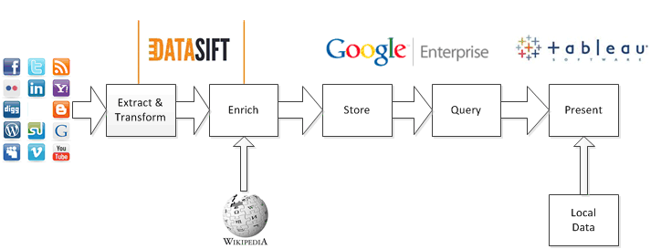
A compelling presentation showing how easy it is to take off-the-shelf software (COTS in the old jargon) to go right from extracting social data to sorting, querying and presenting it.

For those of us from an IT Architecture background I’ve illustrated the ETL/Data Warehouse type steps that these three offerings bring together (they have already built the integrations), it really did look very straightforward.

social data week 1

What was missing, for me, was the ability to explore or analyse the social network. I spoke to Datasift a few weeks ago about Twitter data and they explained that they did not provide follower data so, at this stage, those of us wanting to look into the networks are still going to have to write a bit of code.

Is Instant Messaging being used to pass notes in your meetings?

boredI have observed a couple of behaviours around Instant Messaging (IM) in meetings: the first is IM being used to contact people not in the meeting, either to ask for information pertinent to the meeting, are being asked a question or just to chat about something unrelated because they are bored; the second behaviour is to use IM internally in the meeting where one sub-group will be making comments whilst another is talking. But which of these is more typical and why is this useful to know?

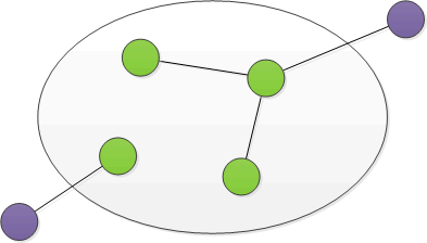
To understand what I’m talking about take a look at this example:

meeting

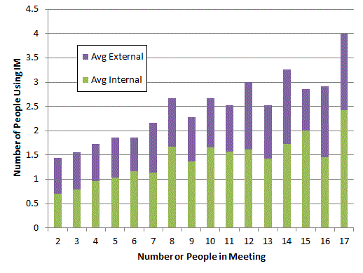
Here we represent four people in a meeting (inside the ellipse) and two people outside the meeting. Lines between the people indicate that they have shared one or more IMs during the meeting. The first chart, below, shows the average number of people involved in IM conversations  for meeting sizes between 2 and 17 people; the sample is about 2000 meetings over 3 months; there are very few meetings with more than 17 people so these are excluded:

IMs in meetings average number of people

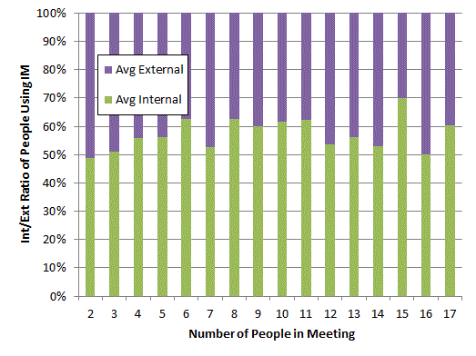
Not unexpectedly as meetings get larger there are a few more people using IM in meetings. The ratio of internal to external IMs looks fairly constant though, but this is best observed with another chart:

IMs in meetings average number of people ratio

The ratio is indeed fairly constant at nearly 50:50.

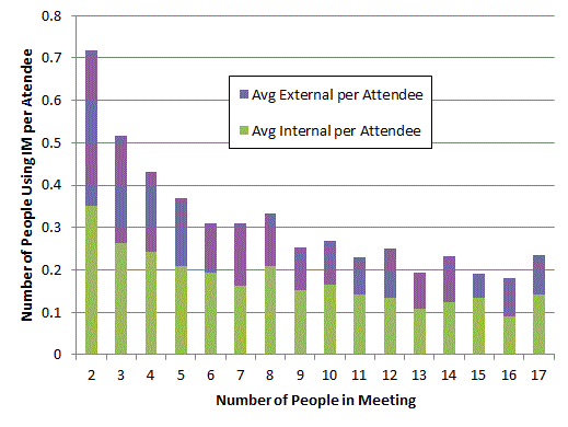
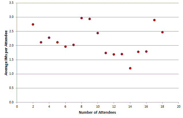
I’ve previously looked for correlations between meeting sizes and number of instant messages (as opposed to the number of people using IM) and not found much. Taking the same approach with the number of people, which is to divide the number of people using IM by the number of people in the meeting we get the following:

IMs in meetings average number of people per attendee

Which, interestingly, shows IMs dropping off on a per-person basis, as the meetings get larger. Is this an indicator of cultural behaviour or is it simply that IM often gets used to tell people the conference call isn’t working / lost the PIN / the phone is broken / can’t use the computer etc.? To answer this would require some analysis of message content, which is possible, but not in the scope of this study. [Complete aside: talking about conference calls check this out]

So why bother? Well most organisations have a bunch of cultural objectives along the lines of “let’s be nice to each other” and, if some further analysis of IMs inside meetings shows that they do not reflect this aspiration, then you can measure your actual culture and observe the trend to see if your cultural change initiatives are working or not.


Effectiveness of Large Meetings Revisited


Some time ago I wrote about examining the numbers of Emails sent during meetings and concluded by saying “looking at instant message traffic during meetings would be more revealing” . I now have some IM traffic to compare.

Before continuing I would like to emphasise that all this data is anonymous and I do not believe it should be examined in any other way because humans are more complex than any analysis of this nature can reveal, it is only useful to find biases for a particular behaviour in a particular situation or identify trends.

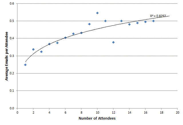
Because I do not have IM data for the same period that my original post relates to I have first re-created the email analysis but restricted it to meetings with all-internal attendees because the IM system is only available employees of the organisation:

emails in meetings 2

This is similar to the previous analysis with the exception of less emails being seen from smaller meetings. This could be due to some major changes in the organisation but I’m not investigating that now.

And now the IMs:

IMs in meetings

Well not the result  I expected but this is what the data tells us: no obvious pattern to IM use compared to meeting size. I’m curious if there might be something buried in here, for example is it always the same people using IM in meetings, are they all in the meeting or are they in communication with people not in the meeting; does this ratio change with meeting size?

Email vs. Instant Messaging for Social Network Analysis, Round 4


In the organisation I’ve been studying I’ve previously described that Instant Messaging (IM) makes a small contribution to the overall understanding of the organisational/social network but this did not tell us if there was anything to learn about when people communicate. To examine this I’ve summarised IMs and emails sent by day, day of week and hour:

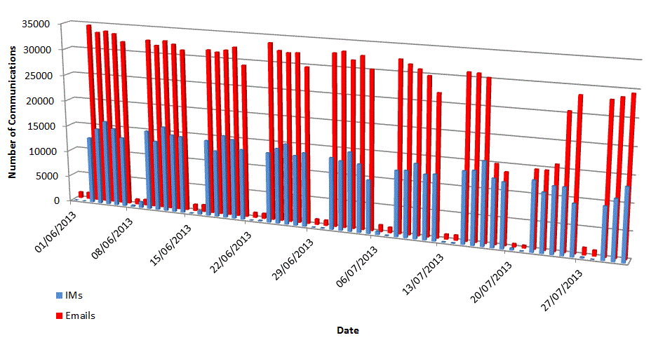
The following chart shows daily activity over a two month period. Note that the dip in emails around 20/07/2013 is due to a number of missing Exchange Server log files.

Email vs IM Day Actual

It can be observed that email is more popular and that the pattern of email and IMs is fairly regular when viewed at this scale. The only slightly unexpected observation is that IMs are more popular mid-week whereas email is more mixed.

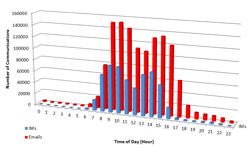
The next question is does time-of-day make a difference?

Email vs IM Time of Day Actual

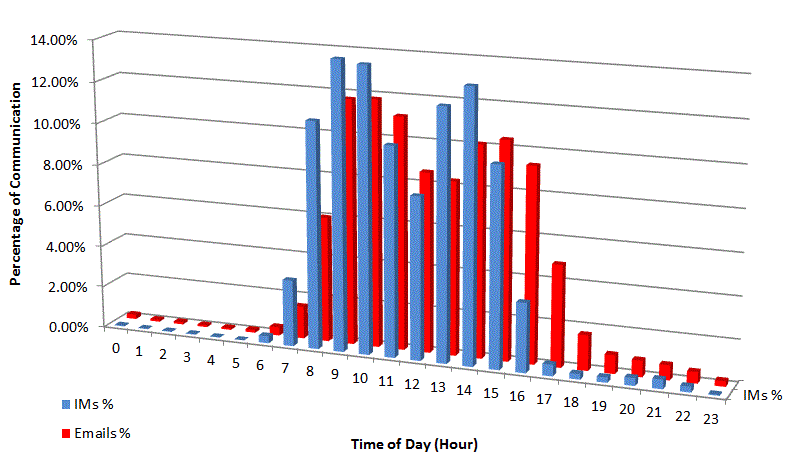
You can see some interesting differences emerging, but to make in clearer I have produced a chart showing the percentages of each communication mechanism:

Email vs IM Time of Day Percentage

Here you can see some clear trends: IMs are more likely to be made when people are first starting work (in the morning 07:00-09:00 and after lunch 13:00-14:00) whereas email dominates the end of the working day (16:00 onwards). Without further study it can only be speculation as to why this is but my theory is that IMs are used more informally and people who are socially close are exchanging greetings whereas Email is more formal and is used to evidence a day’s work complete.

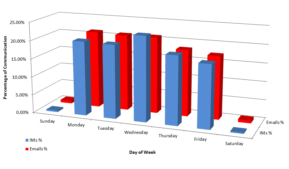
And what about Wednesdays how does that look when we turn the actual numbers into percentages?

Email vs IM Day of Week Percentage

Well, yes, definitely Wednesday is the most popular day for IMs. I can offer absolutely no theory as-to why this is and I’d welcome any suggestions.


theguardian.com: Research finds ‘US effect’ exaggerates results in human behaviour studies

theguardian

Interesting article on theguardian.com: there may be a bias for ‘exciting’ results from U.S. researchers in the human behaviour field. Social Network Analysis draws from Graph Theory to state facts about the nodes/vertices and edges in a graph derived from human interaction but interpreting what this means is more subjective and, because there is an overlap in these fields of study, similar biases are likely to creep in. Do I think this is a problem? Not really, I think most people will try to find a number of studies to take a balance of their findings and, in my opinion, it’s best to try to apply the results to your own data before conclusively accepting them.

Email vs. Instant Messaging for Social Network Analysis, Round 3

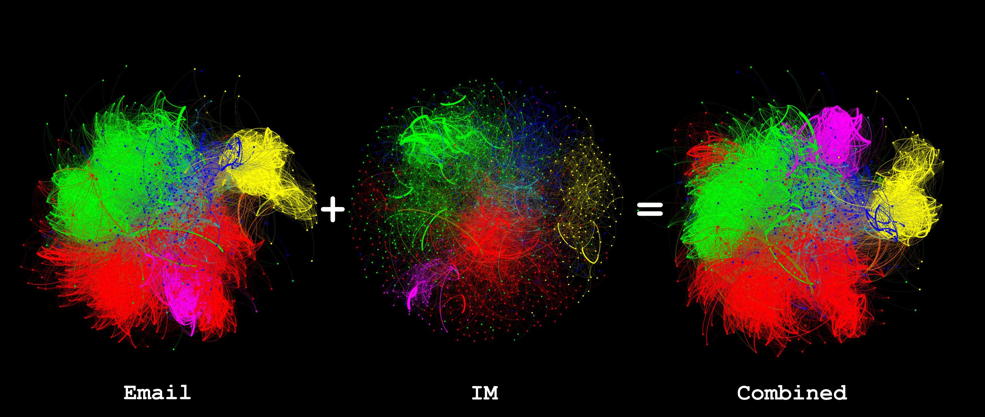
Making the most of available data within an organisation needs to balance the effort of obtaining and analysing the information against the value derived from that information. I’ve been looking to see if IM data is worth collecting when an organisation has already collected email data. The following graphic shows social networks based on Email, IM and then combined data, each colour represents a department in the organisation being studied:

2013-06 to 2013-07 Email plus IM

Visually the following can be observed:

  • Email is much more heavily used than IM and gives a more complete picture of the network
  • The result of combining Email and IM shows that the email structure dominates but, as one can see, the department coloured magenta () has moved from neighbouring the red () department to neighbouring the green () department. At this time I don’t have an explanation as to why such a dramatic change is seen but I will be investigating.

But what do the numbers look like? The following graph metrics were calculated using Gephi:

Email IM Combined
Average Degree

71.672

15.682

74.263

Avg. Weighted Degree

1722.546

705.802

2331.18

Network Diameter

4

7

4

Graph Density

0.054

0.014

0.056

Modularity

0.661

0.689

0.667

Avg. Clustering Coef.

0.395

0.261

0.391

Avg. Path Length

2.281

3.115

2.252


Adding in the IM data has increased Average Degree from 71.6 to 74.2 and Graph Density from 0.054 to 0.056; this shows that it has identified relationships that email did not and, therefore, does enhance the pure email graph.

If using the graph to identify the strength of relationships or influence the next question is what weight to assign to IMs compared to email? My initial thought was that an IM contains much less than an email so would be worth an order of one-tenth of an email. However measuring the average degree of IMs (16) it seems that people are more reserved in who they communicate with using IMs and, presumably, have a closer relationship. Therefore I have equated one IM message with one email message.


Email vs. Instant Messaging for Social Network Analysis, Round 2

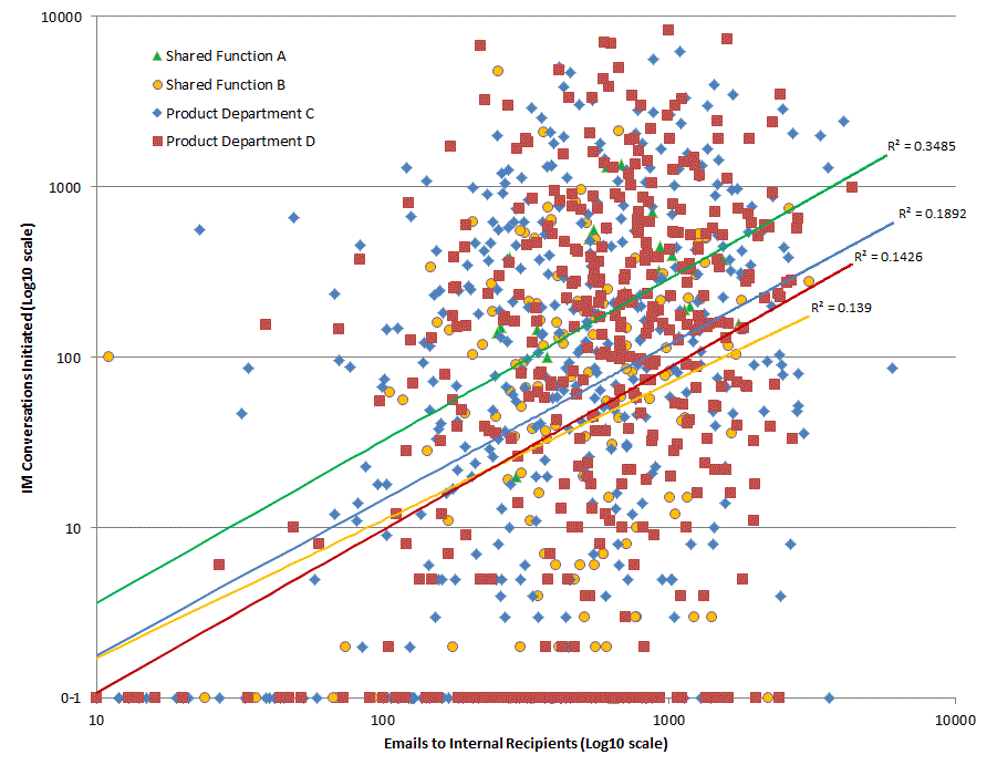
Any organisation that wants to understand the human interactions that drive the organisation will want to use all available data that adds value. The question is it worth the effort of collecting and including Instant Message (IM) data as well as email. I previously looked at an organisation from a departmental level where it could be seen that Email and IM interactions were consistent and adding IM data did not provide additional insight. Starting to look more at individuals the question is does IM data add additional information of value? My starting point is to plot the volume of Email sent by an individual (to recipients internal to the organisation) against the volume of IMs they initiated (again limited to internal parties). The data is also broken down by departments; I’ve included four fom my previous examination of department-level internal and external interactions:

Internal comms data for email and IM scatter

Visually this plot shows there is very little correlation between the volume of Email and the volume of IMs a person in the organisation generates. There are quite a few people in the organisation who do not use the internal IM system and these are clustered on the x-axis; this study is not exploring why this is but it is probably related to the relative newness of IM within the organisation. The departments do not appear to differ significantly in the distributions although Shared Function A does tend to prefer IM more than the other departments do. In my opinion this plot reveals that it is worth continuing to look at the value of IM data.