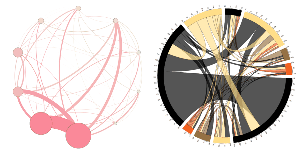
Circular layouts work well for individual to individual visualisations but for group to
group (such as departments in an organisation) where there is close to a fully
connected graph chord diagrams seem to offer a clearer layout. The following
diagram shows the same data for the volume of communication between
departments. They don’t quite show the same thing: the circular layout’s nodes
are proportional to the size of the department whereas the chord is based
purely on the volume of communication.
The circular diagram was created with the circular layout plugin in Gephi; the chord diagram is adapted from this article and uses the ds.j3 library which means it’s interactive in the browser.

 Follow