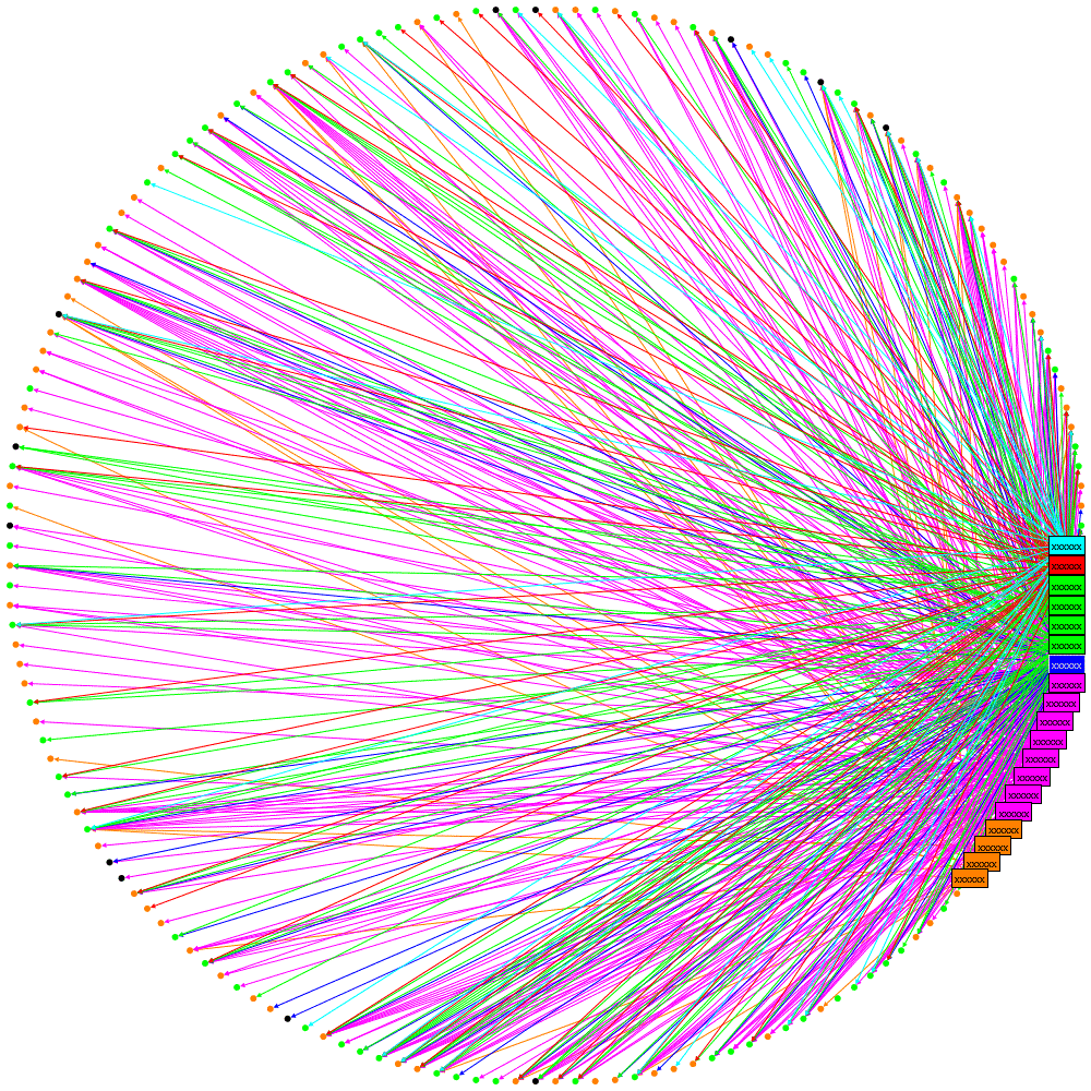
Circular layouts can be very useful and NodeXL does a great job of rapidly exploring social network graphs. However I needed to generate graphs programmatically so turned to the NodeXL libraries. I picked the circular layout but was disappointed with what it produced:

Let me explain what this diagram is attempting to show: the rectangular labels are the organisation’s tweeters, the colours represent a sub-division of the organisation they work for. Unlabelled nodes (circles) are the followers. Followers are coloured green or orange based on which information the organisations would like them to receive and this colouring is the same for two specialist sub-divisions. Where an orange line is seen going to a green follower, or vice-versa, then it can be implied that the follower is not receiving the desired information.
This layout is not great: the order of nodes is just as they were added to the graph: all the organisations’ tweeters were added first so cluster together and there is no logic to the order the remaining nodes (followers) are added.
The first improvement that can be made is to use binning. See http://www.smrfoundation.org/2010/01/14/component-binning-a-network-layout-improvement-in-nodexl-v-108/
To apply Binning with the NodeXL library simply set the UseBinning property:
oCircleLayout.LayoutStyle = LayoutStyle.UseBinning;
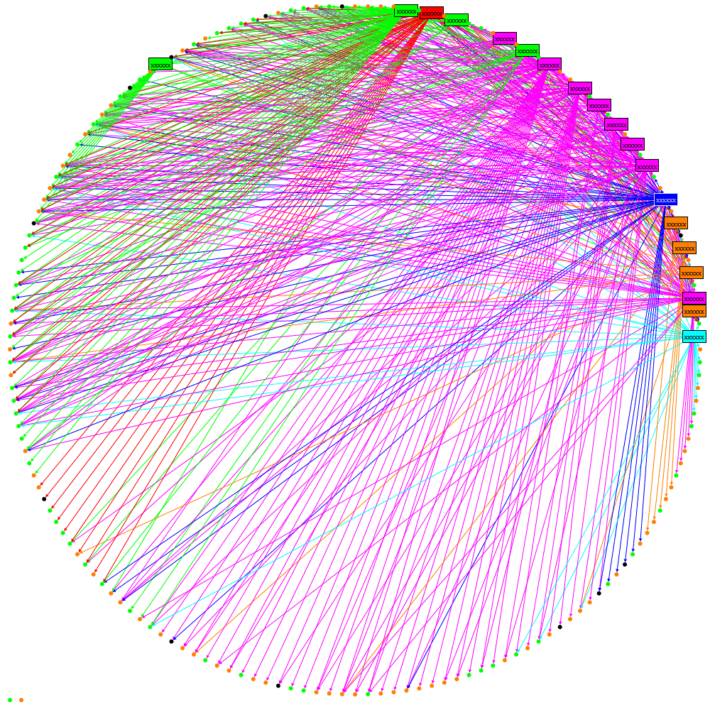
The layout now looks like this:

We can see now that there is a cluster of followers who follow multiple tweeters from the organisation (clustered towards the top). However it is still quite confusing where a lot of lines cross-over. Maybe curved lines would be better….
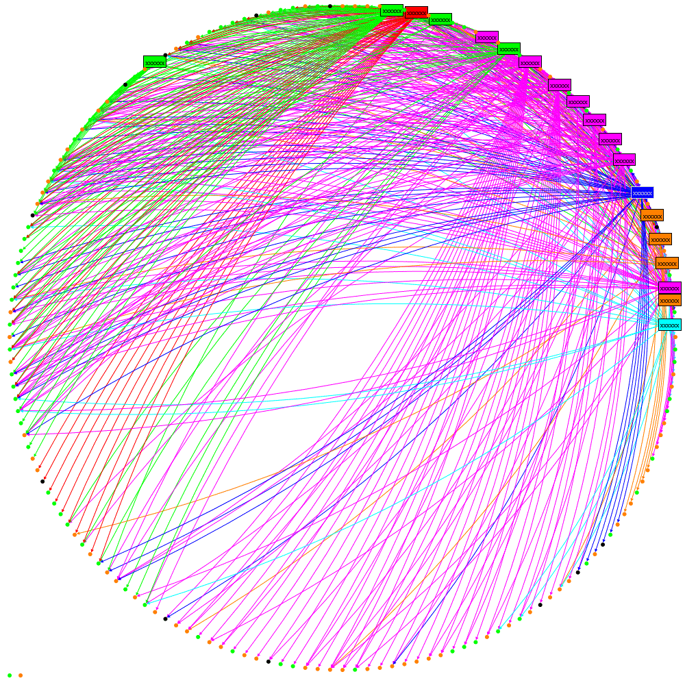
oNodeXLVisual.GraphDrawer.EdgeDrawer.CurveStyle = EdgeCurveStyle.Bezier;

Not really an improvement. The answer is Edge Bundling, see these links for better explanations than I can provide:
http://www.cg.tuwien.ac.at/courses/InfoVis/HallOfFame/2007/Alsallakh/
http://www.win.tue.nl/~dholten/papers/bundles_infovis.pdf
http://www.infosthetics.com/archives/2009/06/force_directed_edge_bundling_for_graph_visualization.html
this is how to add it from the NodeXL libraries:
EdgeBundler ebl = new EdgeBundler();
ebl.UseThreading = false; // when running in Azure or it hangs
ebl.BundleAllEdges(oGraph, new Rectangle(0, 0, GraphWidth, GraphHeight));
oNodeXLVisual.GraphDrawer.EdgeDrawer.CurveStyle = EdgeCurveStyle.CurveThroughIntermediatePoints;
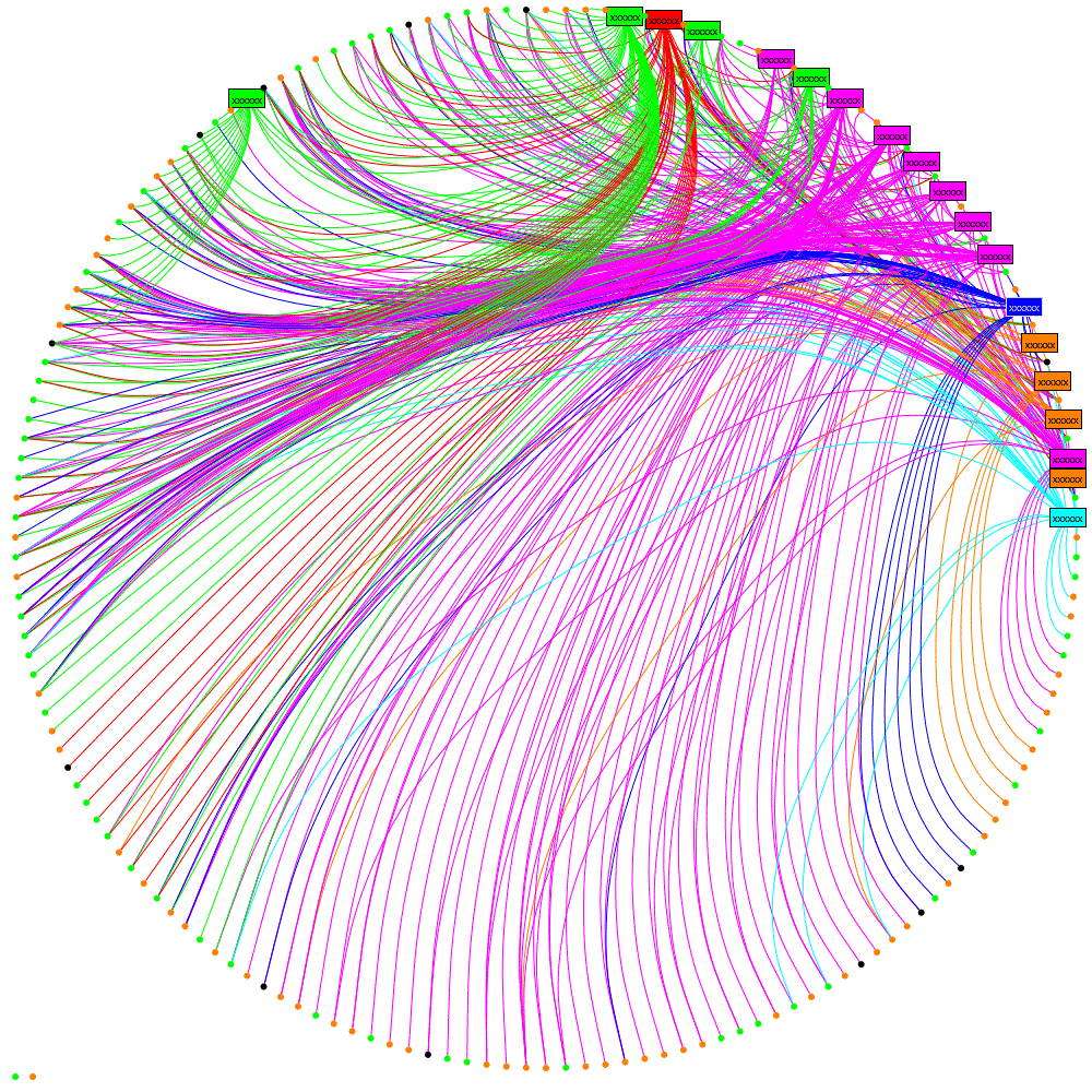
and the result:

which I hope you’ll agree helps reveal some real structure about the tweeters and
their followers.
Update 15/07/2013
I’ve created a test page if you want to try out these features of NodeXL here or get NodeXL
 Follow