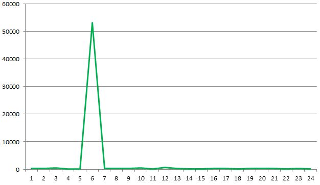
I showed a colleague my dependency map derived from IIS logs. They thought this was pretty useful but also wanted a way to see responsiveness. IIS logs (when enabled) the time taken for a request to complete, full explanation here. It was very easy to manipulate the previous queries I wrote to count calls to instead return an average time taken. I turned it into some simple graphs on a per-server basis:
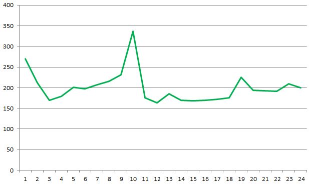
This graph shows the average time taken for each hour on a given server. I wonder where something unusual has happened? Below is the same graph with outliers removed, this is more typical of what was seen across a number of servers:
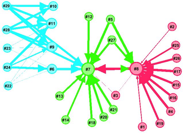
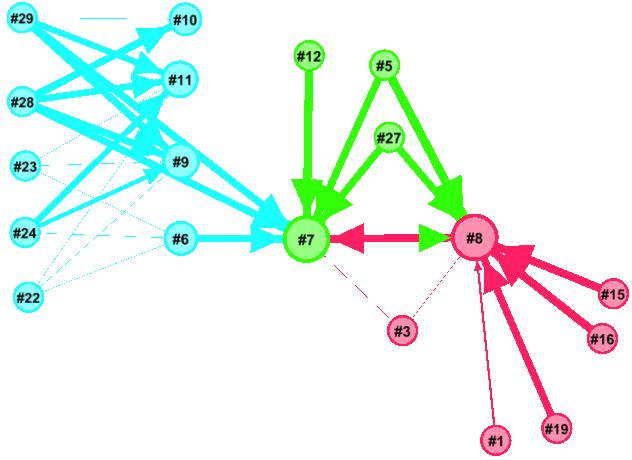
It’s also possible to show a view of all the servers of interest using a graph layout using a tool like Gephi. The weight of each edge represents the average time taken for a call to be serviced, the thicker the line the longer it took. The graph below shows the average time taken for a number of servers over a three week period; the servers to the left are internet-facing and rely on services provided by those to the right:
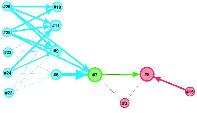
Using Gaphi’s timeline selected times of day can be visualised, below is a quiet period:
And a busy period; note how #8 is receiving calls from many servers and it’s time taken is increasing which is, in turn, increasing time taken from internet-facing servers.
Check out the animation here (wmv)
This piece of work interestingly coincided with a visit to InfoSec Europe: it was awash with vendors offering log analysis and tools that create a more holistic view of interconnected servers. I only saw some brief demos but I thought LogRhythm looked promising.
 Follow