Category Archives: email

Effectiveness of Large Meetings Revisited


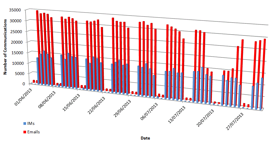
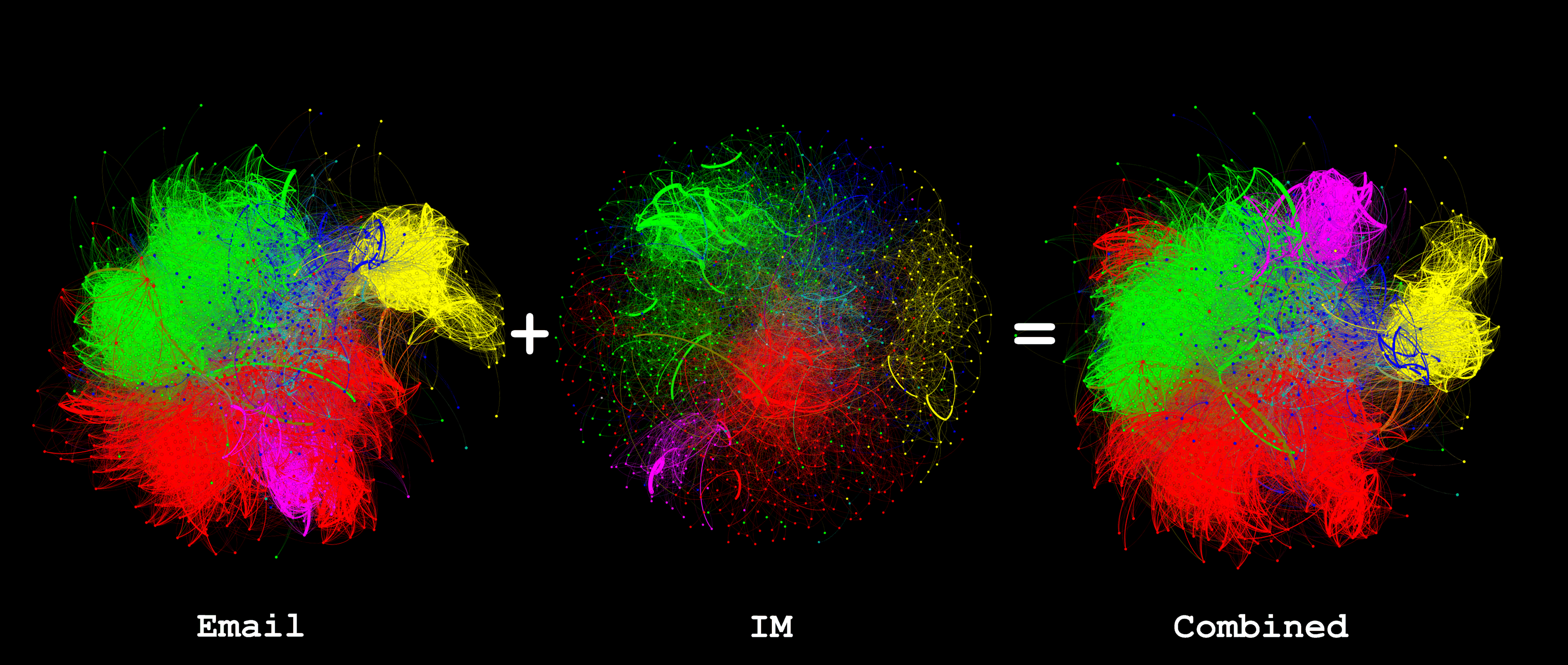
Some time ago I wrote about examining the numbers of Emails sent during meetings and concluded by saying “looking at instant message traffic during meetings would be more revealing” . I now have some IM traffic to compare.

Before continuing I would like to emphasise that all this data is anonymous and I do not believe it should be examined in any other way because humans are more complex than any analysis of this nature can reveal, it is only useful to find biases for a particular behaviour in a particular situation or identify trends.

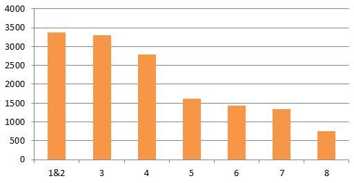
Because I do not have IM data for the same period that my original post relates to I have first re-created the email analysis but restricted it to meetings with all-internal attendees because the IM system is only available employees of the organisation:

emails in meetings 2

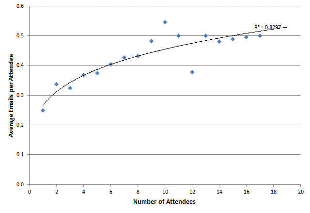
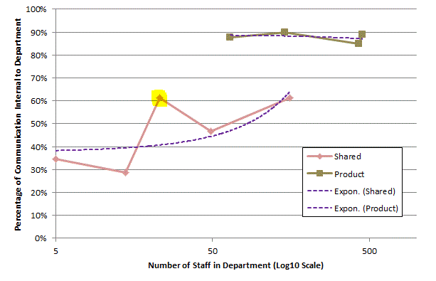
This is similar to the previous analysis with the exception of less emails being seen from smaller meetings. This could be due to some major changes in the organisation but I’m not investigating that now.
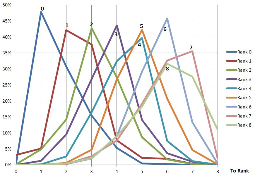
And now the IMs:

IMs in meetings

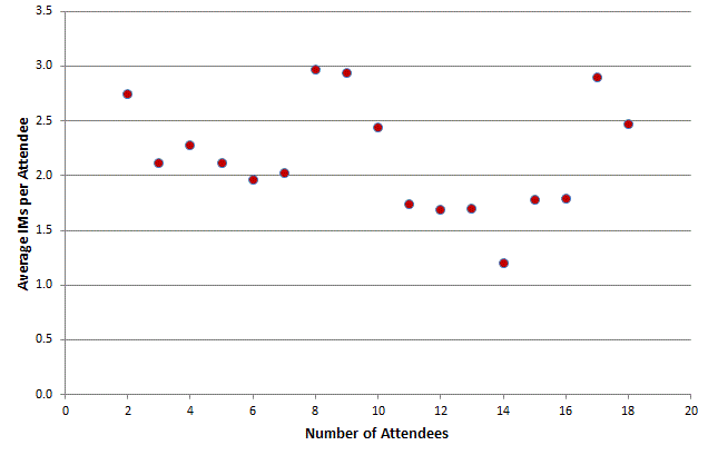
Well not the result  I expected but this is what the data tells us: no obvious pattern to IM use compared to meeting size. I’m curious if there might be something buried in here, for example is it always the same people using IM in meetings, are they all in the meeting or are they in communication with people not in the meeting; does this ratio change with meeting size?

Email vs. Instant Messaging for Social Network Analysis, Round 4


In the organisation I’ve been studying I’ve previously described that Instant Messaging (IM) makes a small contribution to the overall understanding of the organisational/social network but this did not tell us if there was anything to learn about when people communicate. To examine this I’ve summarised IMs and emails sent by day, day of week and hour:

The following chart shows daily activity over a two month period. Note that the dip in emails around 20/07/2013 is due to a number of missing Exchange Server log files.

Email vs IM Day Actual

It can be observed that email is more popular and that the pattern of email and IMs is fairly regular when viewed at this scale. The only slightly unexpected observation is that IMs are more popular mid-week whereas email is more mixed.

The next question is does time-of-day make a difference?

Email vs IM Time of Day Actual

You can see some interesting differences emerging, but to make in clearer I have produced a chart showing the percentages of each communication mechanism:

Email vs IM Time of Day Percentage

Here you can see some clear trends: IMs are more likely to be made when people are first starting work (in the morning 07:00-09:00 and after lunch 13:00-14:00) whereas email dominates the end of the working day (16:00 onwards). Without further study it can only be speculation as to why this is but my theory is that IMs are used more informally and people who are socially close are exchanging greetings whereas Email is more formal and is used to evidence a day’s work complete.

And what about Wednesdays how does that look when we turn the actual numbers into percentages?

Email vs IM Day of Week Percentage

Well, yes, definitely Wednesday is the most popular day for IMs. I can offer absolutely no theory as-to why this is and I’d welcome any suggestions.


Email vs. Instant Messaging for Social Network Analysis, Round 3

Making the most of available data within an organisation needs to balance the effort of obtaining and analysing the information against the value derived from that information. I’ve been looking to see if IM data is worth collecting when an organisation has already collected email data. The following graphic shows social networks based on Email, IM and then combined data, each colour represents a department in the organisation being studied:

2013-06 to 2013-07 Email plus IM

Visually the following can be observed:

  • Email is much more heavily used than IM and gives a more complete picture of the network
  • The result of combining Email and IM shows that the email structure dominates but, as one can see, the department coloured magenta () has moved from neighbouring the red () department to neighbouring the green () department. At this time I don’t have an explanation as to why such a dramatic change is seen but I will be investigating.

But what do the numbers look like? The following graph metrics were calculated using Gephi:

Email IM Combined
Average Degree

71.672

15.682

74.263

Avg. Weighted Degree

1722.546

705.802

2331.18

Network Diameter

4

7

4

Graph Density

0.054

0.014

0.056

Modularity

0.661

0.689

0.667

Avg. Clustering Coef.

0.395

0.261

0.391

Avg. Path Length

2.281

3.115

2.252


Adding in the IM data has increased Average Degree from 71.6 to 74.2 and Graph Density from 0.054 to 0.056; this shows that it has identified relationships that email did not and, therefore, does enhance the pure email graph.

If using the graph to identify the strength of relationships or influence the next question is what weight to assign to IMs compared to email? My initial thought was that an IM contains much less than an email so would be worth an order of one-tenth of an email. However measuring the average degree of IMs (16) it seems that people are more reserved in who they communicate with using IMs and, presumably, have a closer relationship. Therefore I have equated one IM message with one email message.


Intradepartmental Communications as a Percentage of Total Departmental Communication

Any organisation wishing to improve will be interested in how the company functions structurally and want to investigate the causes of deviancy (weather positive or negative) from the norm. The chart below shows the percentage of communication a department generates that is internal to that department plotted against the number of people in the department. The plot is split into two: one for product-focussed departments and one for shared service departments, like HR or Accounts. As can be seen the product-focussed departments are fairly consistent, regardless of size, in that their communications are 85%-95% internal. On the other hand the departments that provide a shared service have an internal communication percentage proportional to the size of the department. Thinking about the results it does seem logical that the shared service departments are more likely to be communicating with other departments than internally but, as they grow in size, will need more internal communication to co-ordinate activities.

See my previous post for the underlying data.

Internal comms percentage for Product and Shared departments

One of the shared service departments, highlighted, spends more time communicating
internally than would be expected looking at the above chart. I can’t say which
department this is but will say that I’m surprised as to which one it is.
Identifying these deviancies (which could be positive or negative depending on
how well the deviant department is performing) allow the organisation to
identify areas for further investigation in order to improve.


Is 1.66 the cosmological constant of Email?

After 6 months of colleting email data it should be possible to spot trends and variations. Some variations, mostly around holiday periods are quite obvious but trends have not been so obvious. One measure in particular has been remarkably constant: the average number of recipients per email. The following plot shows this average over the last 27 weeks for approximately 2,000 people and 10,000,000 emails:

recipients per email

The average across the entire period is 1.66. The only noticeable variation occurs during the Christmas holiday when the organisation is almost completely closed.

Compare this with a couple of other averages:

emails per unique sender

MBytes per unique sender

That last one, which effectively shows the average size of emails, is interesting in that there is a peak immediately following the end of the Christmas holiday; this could be interpreted as a build-up of information suddenly being released or it could be because there is a lot of ‘set-up’ information sent around at the beginning of the year.


What is the distribution of emails sent from one rank to another?

Whilst it appears higher ranks tend to send email downwards and lower ranks upward for a more detailed view it is possible to plot, for each rank, to which other ranks email is being sent. The plots are shown below:

Email_detailed_direction_by_rankJPG

Looking at these plots it can be seen ranks 0-4 send more email to the rank below than any other; ranks 5-7 send more email to the same rank than any other and only 8 sends more upwards (mostly to 6 and7). It can also be observed that the ranks to which email is sent are fairly tightly packed around the sending rank. Without other organisations to observe it difficult to make sweeping generic statements but I think this shows a lack of ‘mobility’ between the ranks and suggests a command-and-control mentality.


Is there a difference in the direction of email for different ranks?

After looking at the overall direction of email the next question is does this vary by rank? The graph below shows the direction of email by rank; as might be expected rank 0 (the most senior) can only send to lower ranks (there is only 1 rank 0) and rank 8 cannot send downwards. In-between the shape of the curve is remarkably well behaved; I would say this does not show much bias at any rank, considering their position:

Email_to_rank_by_rank

Does email get directed down, up or sideways?

Having asked who is sending all the email and who’s receiving it another simple statistic is the percentage of email directed upwards, downwards or sideways in the hierarchy. The following pie chart shows the breakdown of comparing the rank of the sender to the rank of the recipient (for each recipient of the email):

Email_to_rank

Sample size: 10 million

Who’s receiving all that email?

I previously asked who was sending all the email; well the next question is who receives it all? Once again the middle management features highly but then so do the senior managers. This sort of result is probably what I would expect thinking about the roles these groups perform but is this typical of most organisations?

Email Received

Average emails received per person, grouped by rank.