Showing someone a view of their organisation of over 2000 people rendered in Gephi might produce an initial ‘wow’ but they can then struggle to make sense of it. A better approach might be to summarise the information by amalgamating the nodes into departments (or whatever organisational unit is meaningful). The following graph shows the organisation I have illustrated before but broken down into ‘departments’, the sizes of the nodes are proportional to the number of people in the department and the widths of the edges are the totals of all the weights from each underling edge between two groups of underlying nodes. To amalgamate the data I created a query that assigns each node ID (from the underlying SQL database) to a group which is then used to summarise data using in-memory hash tables; this has the advantage, over a SQL ‘group by’ clause, of creating arbitrary groups independent of the fields in the select clause.
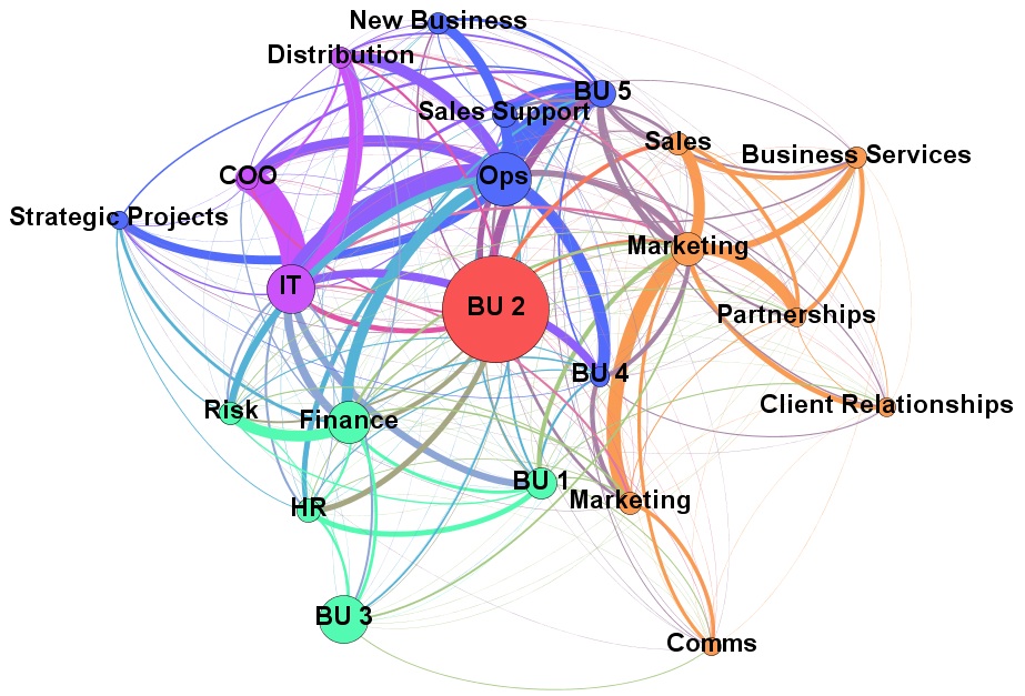
Looking at the graph you can immediately see strong ties between IT and Ops but BU 2 looks a bit isolated given its size.
 Follow