1.66 has been a remarkably constant result for the average number of recipients to which each email is sent. Looking more closely one recipient is by far the most common:
(chart truncated at 10 recipients)
1.66 has been a remarkably constant result for the average number of recipients to which each email is sent. Looking more closely one recipient is by far the most common:
(chart truncated at 10 recipients)
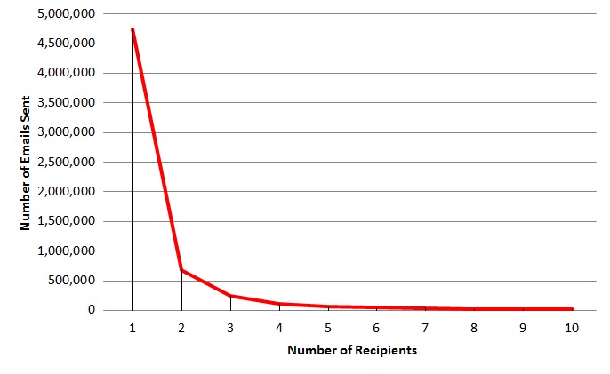
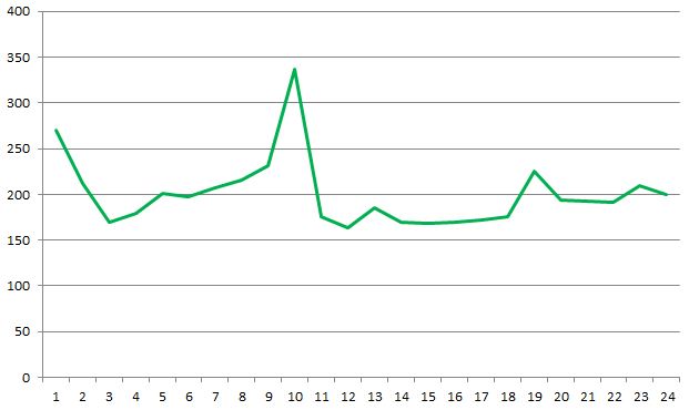
After 6 months of colleting email data it should be possible to spot trends and variations. Some variations, mostly around holiday periods are quite obvious but trends have not been so obvious. One measure in particular has been remarkably constant: the average number of recipients per email. The following plot shows this average over the last 27 weeks for approximately 2,000 people and 10,000,000 emails:
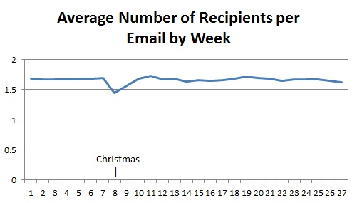
The average across the entire period is 1.66. The only noticeable variation occurs during the Christmas holiday when the organisation is almost completely closed.
Compare this with a couple of other averages:
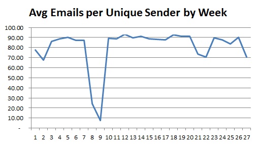
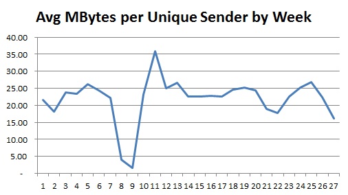
That last one, which effectively shows the average size of emails, is interesting in that there is a peak immediately following the end of the Christmas holiday; this could be interpreted as a build-up of information suddenly being released or it could be because there is a lot of ‘set-up’ information sent around at the beginning of the year.
Whilst it appears higher ranks tend to send email downwards and lower ranks upward for a more detailed view it is possible to plot, for each rank, to which other ranks email is being sent. The plots are shown below:
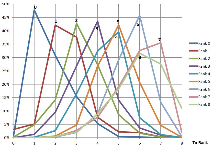
Looking at these plots it can be seen ranks 0-4 send more email to the rank below than any other; ranks 5-7 send more email to the same rank than any other and only 8 sends more upwards (mostly to 6 and7). It can also be observed that the ranks to which email is sent are fairly tightly packed around the sending rank. Without other organisations to observe it difficult to make sweeping generic statements but I think this shows a lack of ‘mobility’ between the ranks and suggests a command-and-control mentality.
After looking at the overall direction of email the next question is does this vary by rank? The graph below shows the direction of email by rank; as might be expected rank 0 (the most senior) can only send to lower ranks (there is only 1 rank 0) and rank 8 cannot send downwards. In-between the shape of the curve is remarkably well behaved; I would say this does not show much bias at any rank, considering their position:
![]()
Having asked who is sending all the email and who’s receiving it another simple statistic is the percentage of email directed upwards, downwards or sideways in the hierarchy. The following pie chart shows the breakdown of comparing the rank of the sender to the rank of the recipient (for each recipient of the email):
![]()
Sample size: 10 million
I previously asked who was sending all the email; well the next question is who receives it all? Once again the middle management features highly but then so do the senior managers. This sort of result is probably what I would expect thinking about the roles these groups perform but is this typical of most organisations?
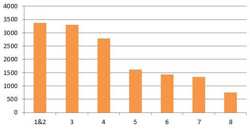
Average emails received per person, grouped by rank.
This is a pretty simple metric to look at but might be quite revealing to your organisation. I’ve matched the sender of an email to their rank derived from the corporate directory. The rank is their position from the top of the directory e.g. A manages B manages C – if A is at the top of the directory then A=1, B=2 and C=3; this approximates their grade and roughly those ranked 1-2 are senior executives, 3-4 are middle management and 5+ get to do all the work. The chart shows the average number of emails sent at each rank over a number of months. Ranks 1 and 2 are combined because rank 1 is a very small sample.
I showed a colleague my dependency map derived from IIS logs. They thought this was pretty useful but also wanted a way to see responsiveness. IIS logs (when enabled) the time taken for a request to complete, full explanation here. It was very easy to manipulate the previous queries I wrote to count calls to instead return an average time taken. I turned it into some simple graphs on a per-server basis:
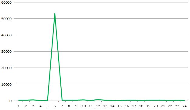
This graph shows the average time taken for each hour on a given server. I wonder where something unusual has happened? Below is the same graph with outliers removed, this is more typical of what was seen across a number of servers:
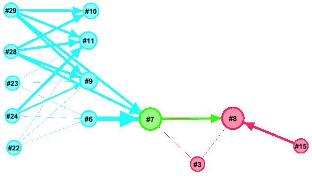
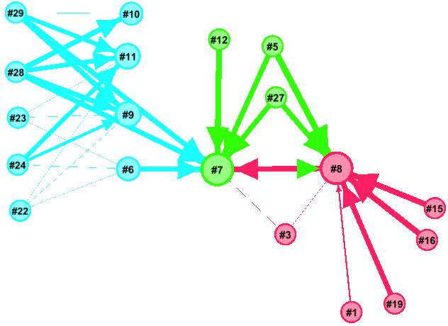
It’s also possible to show a view of all the servers of interest using a graph layout using a tool like Gephi. The weight of each edge represents the average time taken for a call to be serviced, the thicker the line the longer it took. The graph below shows the average time taken for a number of servers over a three week period; the servers to the left are internet-facing and rely on services provided by those to the right:
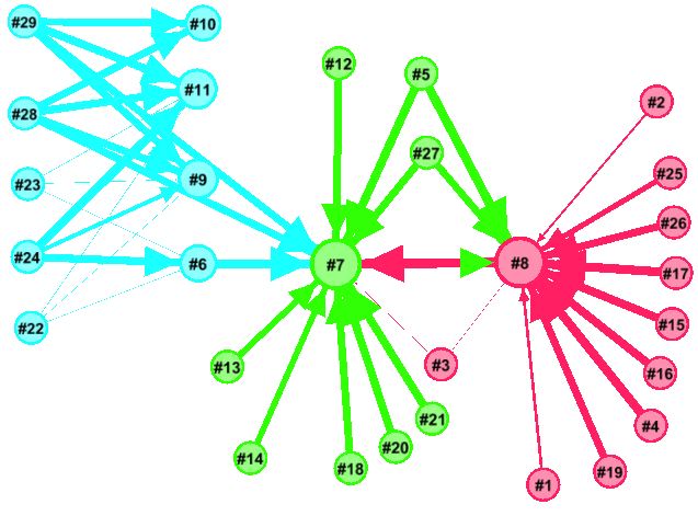
Using Gaphi’s timeline selected times of day can be visualised, below is a quiet period:
And a busy period; note how #8 is receiving calls from many servers and it’s time taken is increasing which is, in turn, increasing time taken from internet-facing servers.
Check out the animation here (wmv)
This piece of work interestingly coincided with a visit to InfoSec Europe: it was awash with vendors offering log analysis and tools that create a more holistic view of interconnected servers. I only saw some brief demos but I thought LogRhythm looked promising.
In my previous post I described searching from a number of target nodes (e.g. people that speak German) back to the querying user (node). It’s very simple (probably simpler) to show a person what their network looks like, pretty much in the way any social networking site can. I’ve combined the results from the two following Cypher queries, the first finds friends and the second friends of friends. I’m sure it could all be done in one query (help me Cypher experts):
START n=node:node_auto_index(email = ‘[email protected]’) MATCH p = (n)–(x) RETURN DISTINCT length(p) AS len, EXTRACT( n IN NODES(p):n.email) AS email, EXTRACT( r IN RELATIONSHIPS(p):r.score) AS score
START n=node:node_auto_index(email = ‘[email protected]’) MATCH p = (n)–(x)–(y) RETURN DISTINCT length(p) AS len, EXTRACT( n IN NODES(p):n.email) AS email, EXTRACT( r IN RELATIONSHIPS(p):r.score) AS score
Again the results from these queries is loaded into memory and ordered by the lowest (weakest) edge score in each path and the highest rated are visualised using NodeXL:
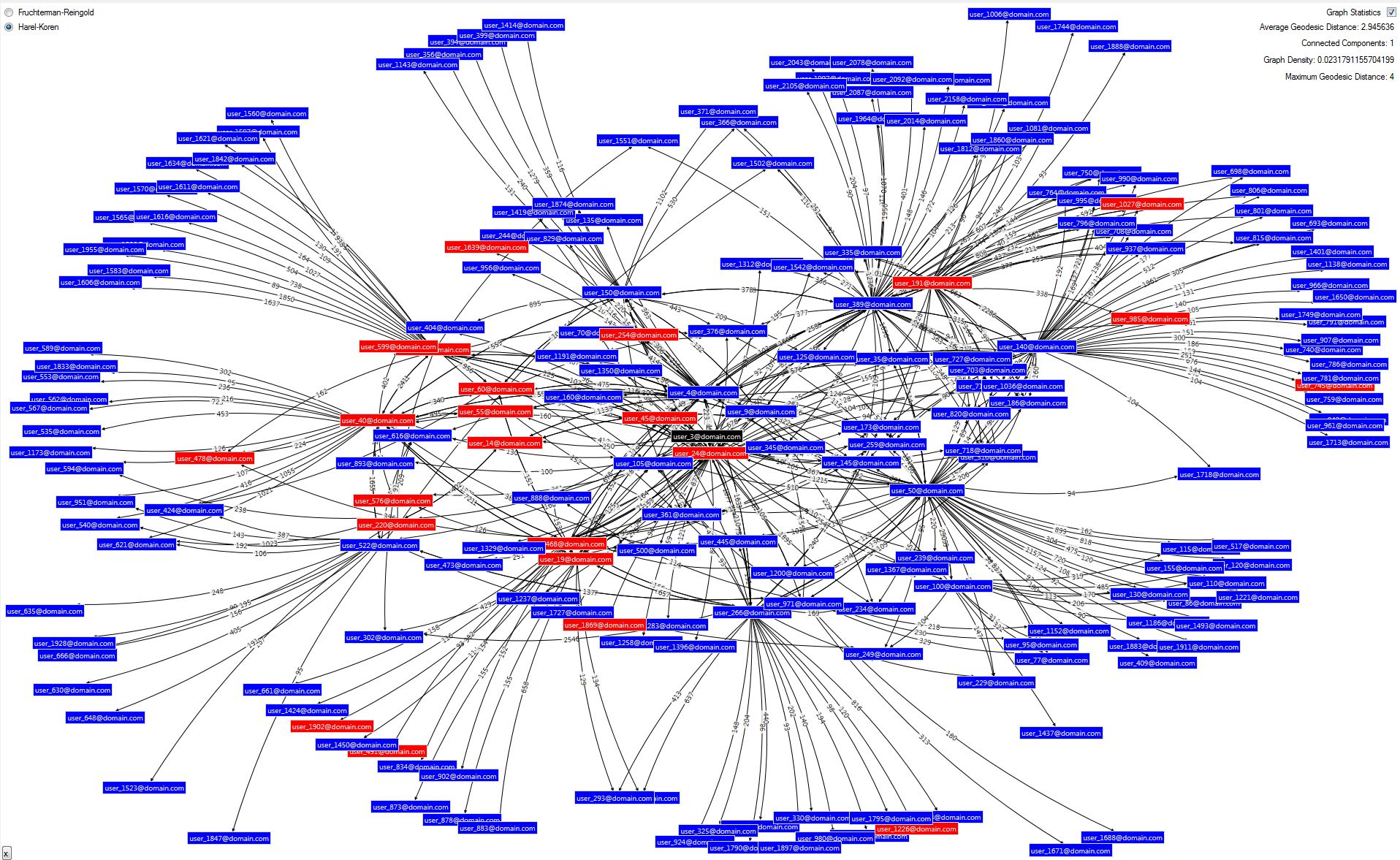
The central person (node), whose network is displayed is coloured black and their connections are blue; red nodes are people who have left the organisation – probably not that useful here.
Showing someone a graph of where they fit into an organisation along with over 2000 colleagues is simply not practical, not only can’t it all be fitted on a screen at a meaningful level but it’s just going to be a mess of edges (connections). I previously described loading SNA data first into a relational database and then into Neo4j. The structure I have built in Neo4j is quite simple: a node (person) has a number of attributes including email address and languages which is a list of languages a person speaks (people provide this information to the corporate directory). The edges in Neo4j have a single attribute, score, which attempts to represent the relative strength of the relationship between two people (nodes). The score is derived from a number of data sources I have previously described.
So here’s the scenario I’m looking at: let’s say you need to find someone who speaks German; the corporate directory can be searched on a number of attributes including language but what if you don’t know any of the people who speak German and you don’t really want to approach people you don’t know. Well this is where your friends of friends might be able to help but how do you know which of you friends may know one of the people who speak German. Well this is perfect territory for graph databases.
To query Neo4j firstly I’ve enabled auto-indexing for the email and languages attributes (along with others); this is done by editing the neo4j.properties file in the conf folder:

Then, using the Neo4j’s cypher query language execute the following (I’m rather proud of this Cypher query but I’m sure a Cypher expert might be able to put me right):
START
n=node(*), m=node:node_auto_index(email = ‘[email protected]’)
MATCH
p = allShortestPaths( (m)<-[r*..6]->(n) )
WHERE
n.languages =~ ‘(?i).*german.*’
RETURN DISTINCT
length(p) AS len,
EXTRACT( n IN NODES(p):n.email) AS email,
EXTRACT( r IN RELATIONSHIPS(p):r.score) AS score
ORDER BY
length(p)
Let’s take that apart:
Now shortest paths are best, right? Well maybe but from the work I’ve previously described there is a score for every relationship (edge), is a short path with low scores better than a long path with high scores? Well I don’t know and I’d love to hear from anyone who’s read a paper on the subject or has any views. The following illustrates this, the capital letters represent a node (person) and the number in brackets is the score of the relationship between the two nodes. A is the user making the query and X speaks German, there are the following paths:
Path 1: A–(350)–B–(193)–X
Path 2: A–(5)–C–(9)–X
Path 3: A–(150)–D–(210)–E–(105)–X
Clearly the first is pretty good: the path is short and the relationships are relatively strong. But what about the next one, the path is short but A does not know C that well and, likewise, C does not know X well; it may be better to go via D and E, although the path is longer everyone on it probably has a strong relationship.
Having experimented empirically I found a good result is obtained by ranking the paths based on the lowest relationship score in the path (think of this as the ‘weakest link’), the above three paths are ordered thus (I have highlighted the ‘weakest link’ in each):
Path 1: A–(350)–B–(193)–X
Path 3: A–(150)–D–(210)–E–(105)–X
Path 2: A–(5)–C–(9)–X
Results with this ranking appear to work very well; in general shortest paths tend to feature and longer paths with high scores are rarer because, of course, it only takes one weak link to demote it in the rankings.
The ranked paths can be presented to the user but there is often a lot of redundancy, it could be that Path 3 is repeated but going through node F instead of E. Therefore I’ve found it better to turn the list of paths back into a graph. I’ve used a visualisation component from the excellent NodeXL library to do this. I’ve also limited the number of paths displayed as too many produce a somewhat unreadable result; this is why ranking the paths was important, we want to display the best ones if we can’t display them all.
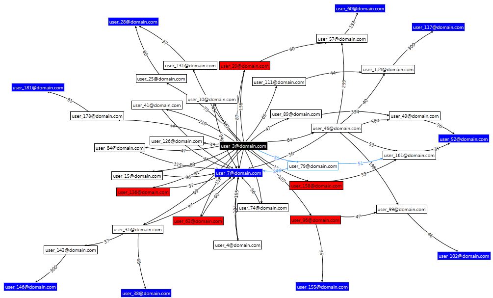
The black node in the centre is the user making the query; blue nodes are people who can speak German; white nodes are intermediaries. The red nodes represent people who have left the organisation, they aren’t really that useful here I just haven’t got round to adding an option to filter them out. Each relationship (line) is labelled with the score (strength).
 Follow